.0
Non-Native (ReactJS) White-label Design Guide 2020
Prepared by: Prapim Chutaprutikorn
Last updated: July 2020
Table of Contents
How to organize and name files 8
Workflow of Screens (Desktop) 13
Workflow of Screens (Mobile) 14
App Customization and Image Dimensions 15
Login screen: Login graphic 27
(Multi-Project Apps only) Masters Screen 30
Swipe to navigate button (optional) 37
White-Label References
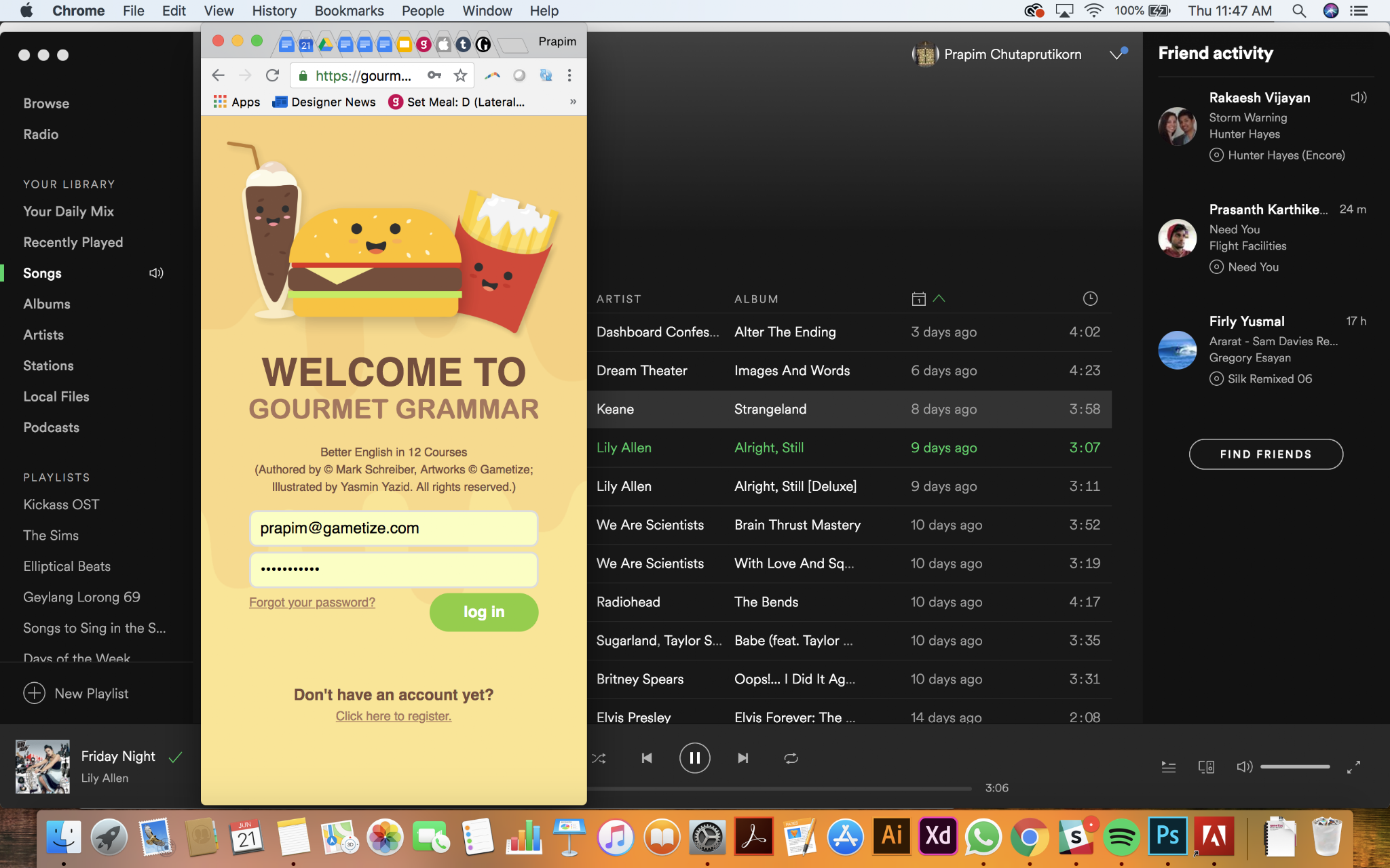
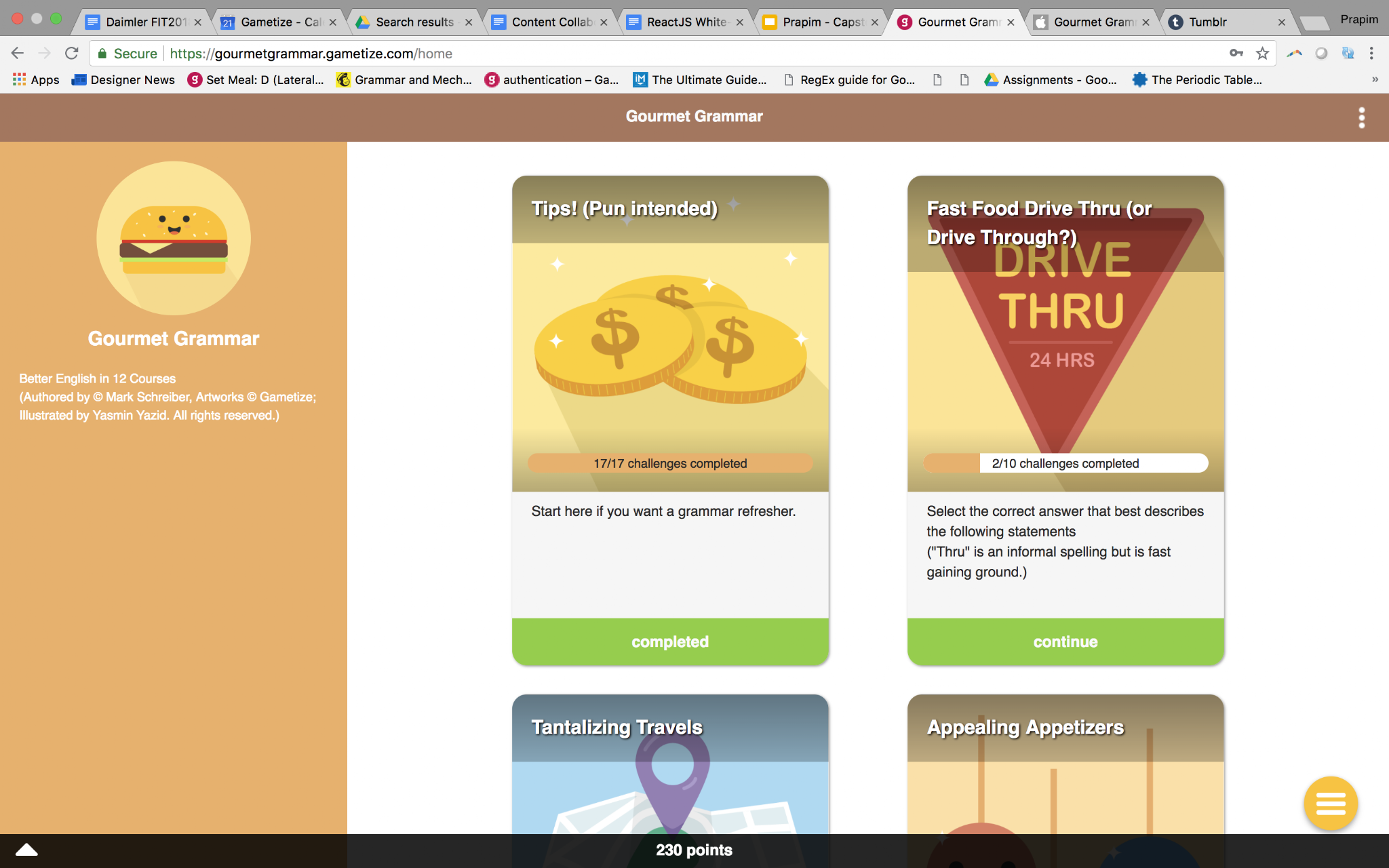
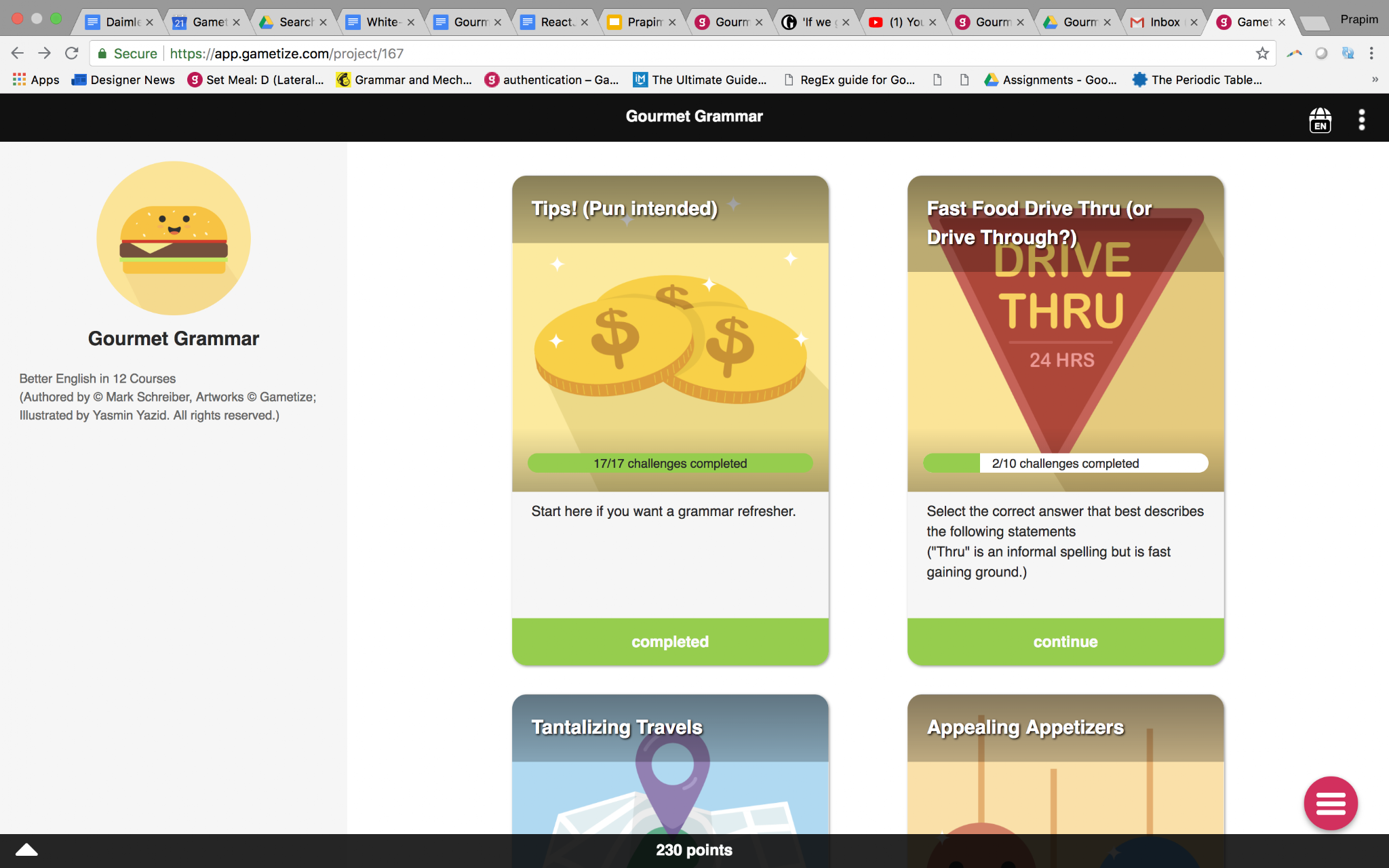
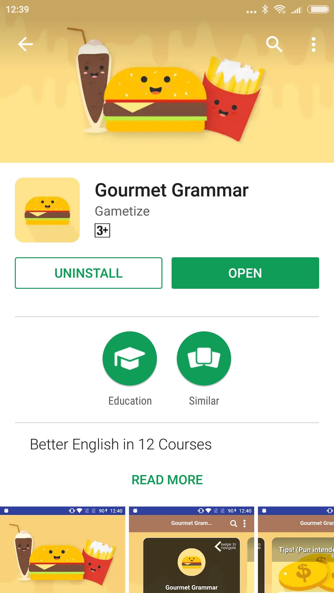
Download some of our white-label apps to get a better idea of how your customizations might look. Here are some of our selected apps for you to try:
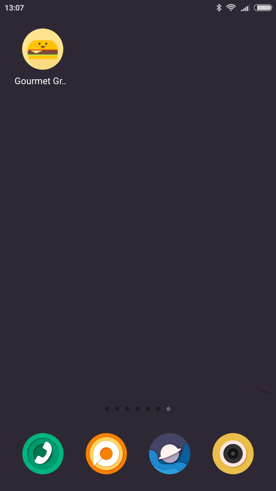
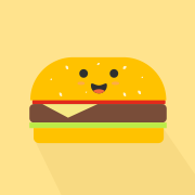
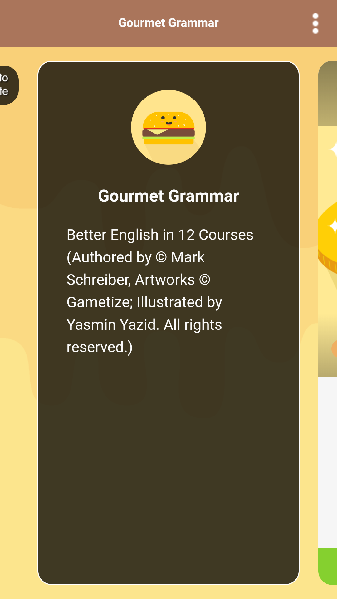
Gourmet Grammar Improve your English with Gourmet Grammar! | |
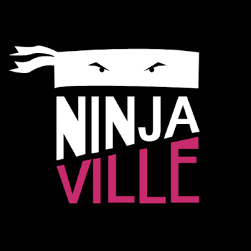
Ninjaville Welcome to NinjaVille! Join our NinjaVille dojo to learn all about Gametize and become a Gametize Ninja! |
Designing for React
Screen sizes
React is responsive (i.e. assets will be resized to accommodate a variety of screen sizes). Thus, your designs will be resized accordingly. It’s best to create your design with the desktop screen size in mind (1920Wx1080H) and then scale down.
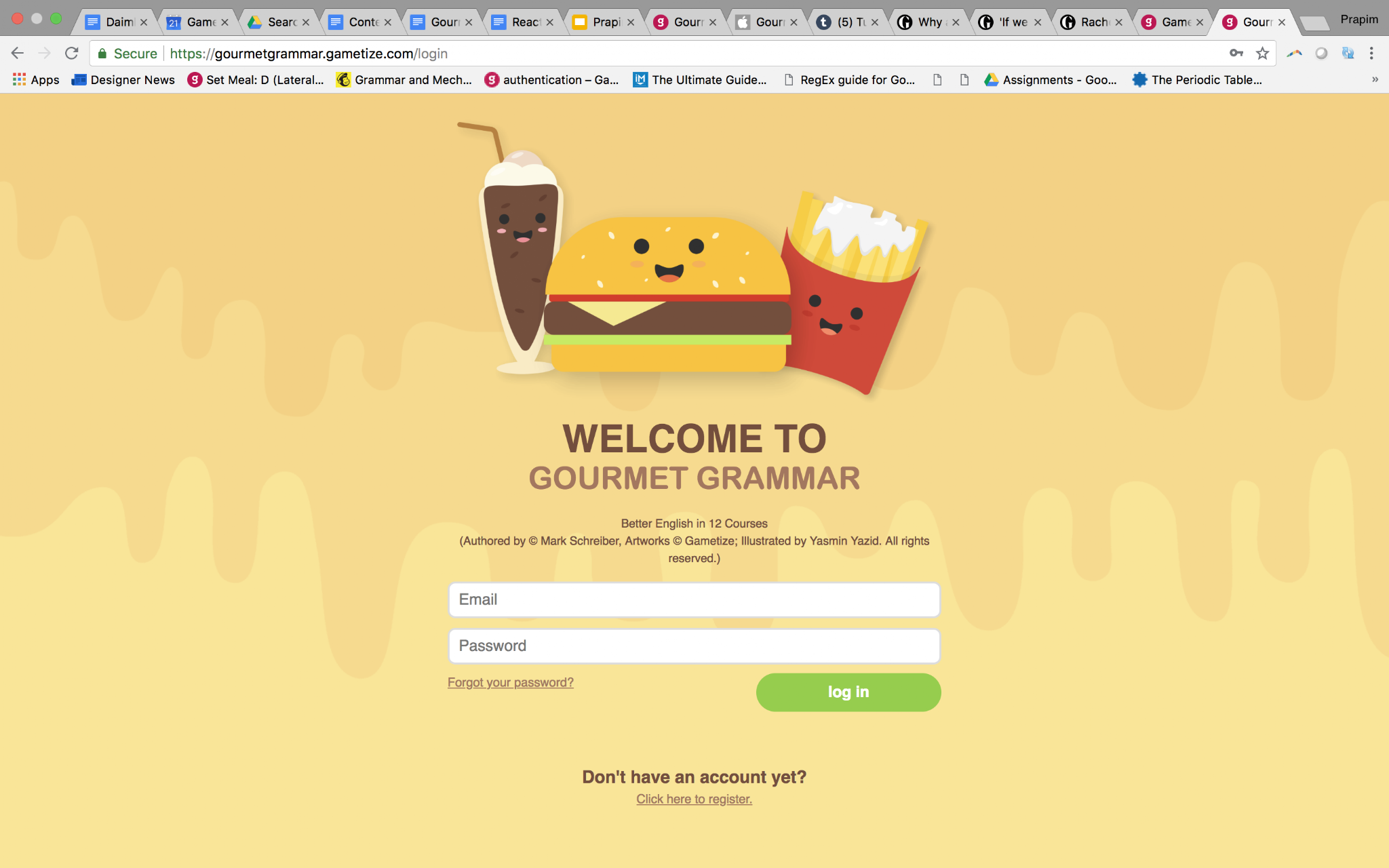
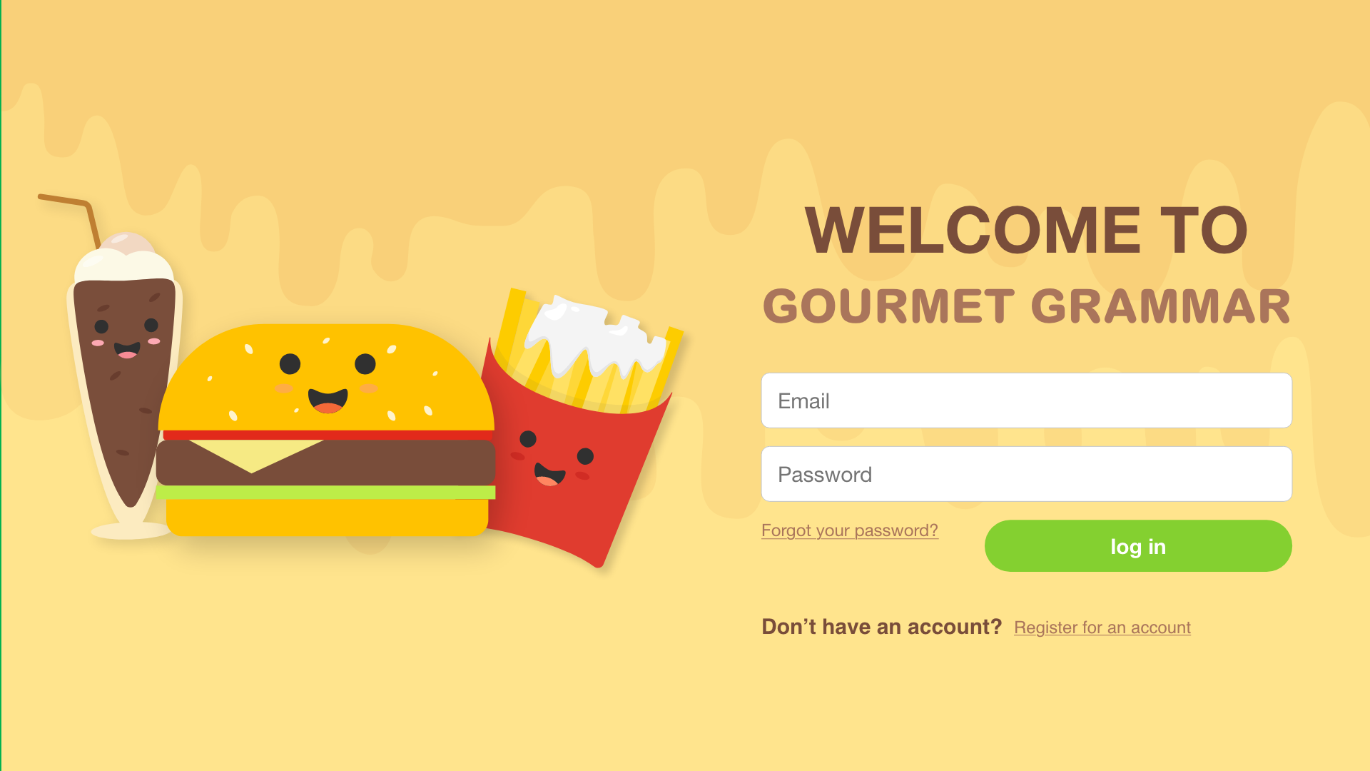
Gourmet Grammar login screen on desktop
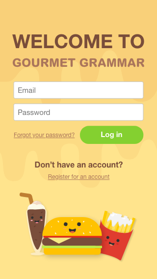
Gourmet Grammar login screen on mobile |
There are still some assets that will be hard-coded to the iOS and Android apps. These assets will need to be designed to the screen sizes of each mobile device.
Do expect your design may not appear exactly as intended, i.e. it will not be “pixel-perfect”. Your design should be versatile enough to accommodate such cases.
General rules of thumb:
- Don’t place important elements outside of the “safe areas” – it may be cropped off
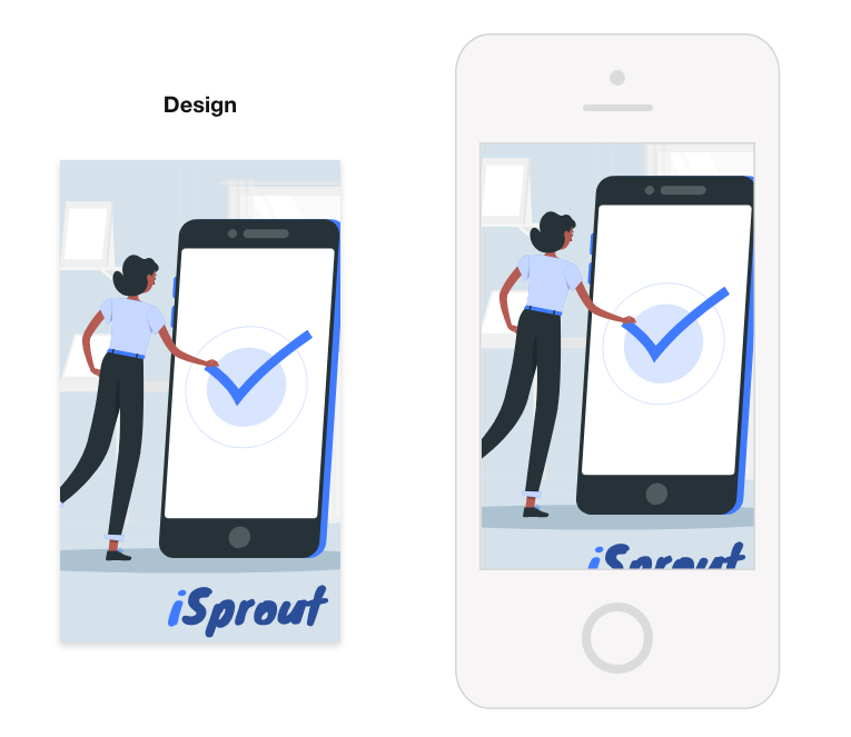
The logo is cropped off due to it being outside of the “safe area”.
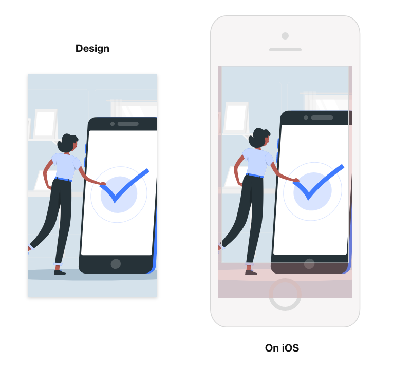
Designing for iOS
- Images that don’t fit in iOS devices are cropped from the bottom, unless specified.
- In some screens, the crop will be quite generous – do keep this in mind for your design.
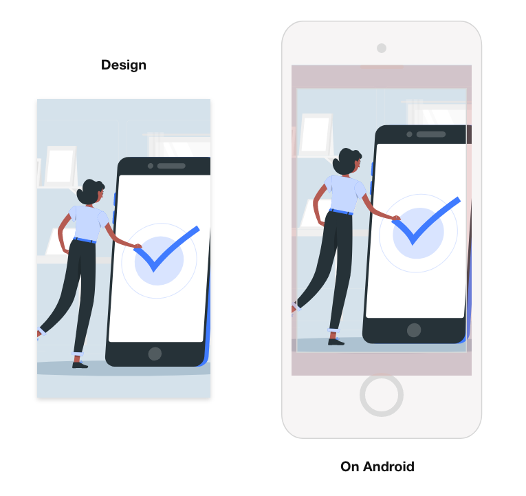
Designing for Android
- There are 5 dimensions:
- XXXHDPI
- XXHDPI
- XHDPI (extra high)
- HDPI (high)
- MDPI (medium)
- Images that don’t fit in Android devices are cropped to the centre (i.e. on all sides), unless specified.
Designing for iOS & Android
Saving image files
Follow these settings when saving your files:
- Export your files in PNG format
- Preserve transparency wherever needed
- Images should be in 72dpi ONLY
- Image colors should be in RGB ONLY
- Ensure dimensions are exact
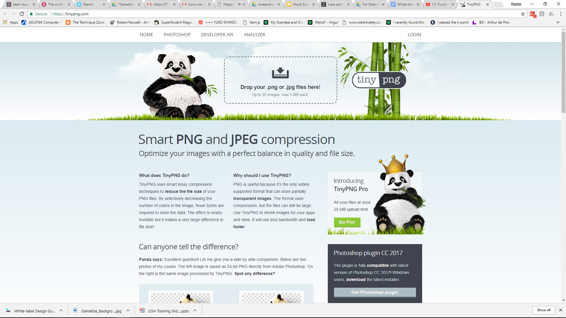
- Optimize & compress your files using a compressor tool, such as TinyPNG
TinyPNG (http://tinypng.org) will help speed up the app’s loading time with no significant decrease in image quality.
Compress all designs, EXCEPT:
- App Icon
- Android Feature Graphic
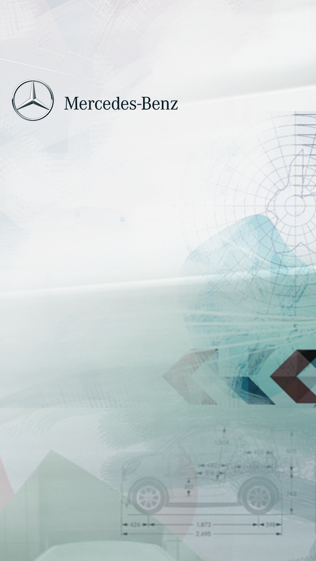
Uncompressed (left) vs. Compressed (right). There is no significant change in quality,
but the file size has been reduced from 647.5KB to 193.2KB, a 70% decrease. Wowza!
Designing for iOS & Android
How to organize and name files
It’s important to organize and name your files correctly. Please follow the naming convention indicated at the end of each asset.
[appname]\iOS\misc |
For XXXHDPI: [appname]\android\drawable-xxxhdpi For XXHDPI: [appname]\android\drawable-xxhdpi For XHDPI: [appname]\android\drawable-xhdpi For HDPI: [appname]\android\drawable-hdpi For MDPI: [appname]\android\drawable-mdpi |
Rules of thumb:
- Follow the conventions exactly – even the capitalization and the spacings
- If your app name has special characters, omit them in your folder names.
Consult this wiki for a list of special characters (not exhaustive): https://en.wikipedia.org/wiki/Filename#Filename_extensions
(e.g. If your app name is “Connect & Play”, your folder name should be a similar variation such as “connectplay”, “connect-play”, “connect-and-play”, etc.)
Color code
React uses HEX color code, which can be easily retrieved from Photoshop/Illustrator/InDesign’s color picker under the # box.
Alternatively, you can also pick colors from this website: https://htmlcolorcodes.com
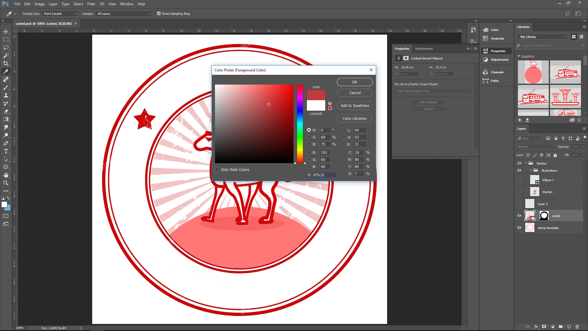
Use the color picker tool in Photoshop to pick out the HEX color code.
Designing for iOS & Android
Buttons
All buttons in the app are now created using CSS so there is no need for button designs. The default look for buttons are a rounded rectangle for text buttons...
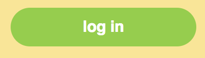
(Left) Default action button (Right) Default button when action has been completed
...and a circle for icon buttons.
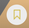
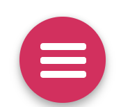
(Left) Bookmark button (Right) Hamburger menu icon
Designing for iOS & Android
Typeface
We use Helvetica as our default white-label typeface.
For the login screen, you are able to customize the typeface of the title and subtitle. (We will cover this in a later section.)
Typeface colors
Some of these colors are customizable, which we will highlight in a later section.
Small Text: #666666 | |
Link: #bc1954 (dark pink) | |
Topbar Text: #ffffff (white) Topbar Background: #292929 (dark gray) | |
Sidebar Text (web only): Sidebar Background (web only): #f6f6f6 (light gray)* *this is not visible on mobile | |
Danger Text/Button: | |
Danger Fade Text/Button: #e53935 (bright red) | |
Success Text/Button: #85d02f (green) |


Workflow of Screens (Desktop)
1. Login screen where Player can sign in using email or register for an account
2. Home screen where the Player can access different parts of the game, such as Rewards, Points, and Challenges
Workflow of Screens (Mobile)
1. Launch app via App Icon | 2. Launch screen when app is loading | 3. Login screen, where user can sign in using email or register for a new account |
4. (WIP, not available yet) Tour screens appear after login | 5. (If your app is multi-Project) Masters screen showing all Projects | 6. Home screen where the Player can access different parts of the game, such as Rewards, Points, and Challenges. |
App Customization and Image Dimensions
What you can customize in a white-label app are the front-facing screens, i.e. what the user will interact with before they get to the meat of the game. You should apply your branding consistently throughout these elements.
At a glance, these customizable elements are:
- Android Feature Graphic
- Color Palette
App Customization and Image Dimensions
App Icon
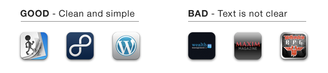
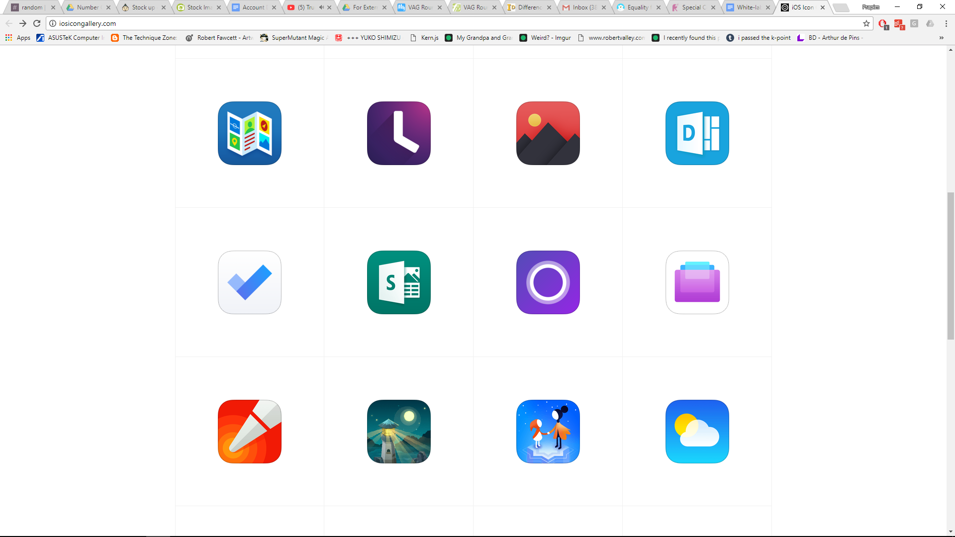
The design of the App Icon should be scalable because it will be shown in very small sizes. Keep it as simple as possible – overly complicated App Icons fall victim to bad scalability.
Visit http://iosicongallery.com for inspiration in designing the App Icon.
App Customization and Image Dimensions
App Icon
For iOS
You do not need to save the image with a rounded border because Xcode will be doing it for you.
Visit https://developer.apple.com/library/ios/qa/qa1686/_index.html for more information about iOS app icons.
iOS App Icon | ||
Description | File Name | Dimension WxH (px) |
App Store icon | icon_1024.png | 1024x1024 |
icon_180.png | 180x180 | |
icon_120_1.png | 120x120 | |
icon_120_2.png | 120x120 | |
icon_87.png | 87x87 | |
icon_80.png | 80x80 | |
icon_60.png | 60x60 | |
icon_58.png | 58x58 | |
icon_40.png | 40x40 | |
[appname]\iOS\misc |

App Customization and Image Dimensions
App Icon (Android)
For Android
For the Play Store icon, you do not need to save the image with a rounded border because Google Play will dynamically handle masking to be approximately 20% of the icon size.
This does not apply to the XXXHDPI, XXHDPI, XHDPI, HDPI, and MDPI app icons. For these icons, the rounded corners must be applied during the image creation.
Visit https://developer.android.com/google-play/resources/icon-design-specifications for more information about Android app icons.
Android App Icon | ||
Description | File Name | Dimension WxH (px) |
Play Store icon | launcher.png | 512x512 |
XXXHDPI | launcher.png | 192x192 With 27px rounded corner radius |
XXHDPI | launcher.png | 144x144 |
XHDPI | launcher.png | 96x96 |
HDPI | launcher.png | 72x72 |
MDPI | launcher.png | 48x48 |
For the Play Store icon: [appname]\android For XXXHDPI: [appname]\android\drawable-xxxhdpi For XXHDPI: [appname]\android\drawable-xxhdpi For XHDPI: [appname]\android\drawable-xhdpi For HDPI: [appname]\android\drawable-hdpi For MDPI: [appname]\android\drawable-mdpi |
App Customization and Image Dimensions
Launch Screen
A Launch screen is a placeholder image that displays when your app starts up.
This will only be shown on the screen for a few seconds, so keep it minimal. Usually just these elements are enough:
- Background color OR image
- Logo
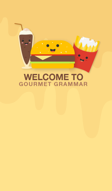
- (Optional) Short introductory text, e.g. “Welcome to Gourmet Grammar”
- (Optional) Feature image, simplified
- (If partnership app) “Powered by Gametize”
Here are some examples of launch screens: http://appdevelopment.daffodilsw.com/blog/25-best-splash-screen-examples-for-mobile-apps
App Customization and Image Dimensions
Launch Screen
iOS Launch Screen | ||
Exact view handled by iOS | ||
Description | File Name | Dimension WxH (px) |
iOS Launch screen | 1x.png | 320x480 |
2x_1.png | 640x960 | |
2x_2.png | 640x960 | |
retina4_1.png | 640x1136 | |
retina4_2.png | 640x1136 | |
4_7inch.png | 750x1334 | |
x.png | 1125x2436* | |
5_5inch.png | 1242x2208 | |
[appname]\iOS\misc |
Android Launch Screen | ||
Description | File Name | Dimension WxH (px) |
XHDPI | launch.png | 720x1230 |
HDPI | launch.png | 540x923 |
MDPI | launch.png | 360x615 |
For XHDPI: [appname]\android\drawable-xhdpi For HDPI: [appname]\android\drawable-hdpi For MDPI: [appname]\android\drawable-mdpi |
App Customization and Image Dimensions
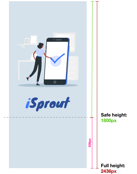
Launch Screen (iOS)
iOS Launch Screen | ||
Description | File Name | Dimension WxH (px) |
x.png | 1125x2436** | |
*Take care to adhere to the following guidelines, as this asset has a generous crop on some devices.
The dashed line indicates the safe area for the design. Place all important elements above the Safe height area –
|
App Customization and Image Dimensions
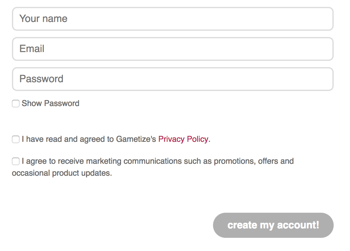
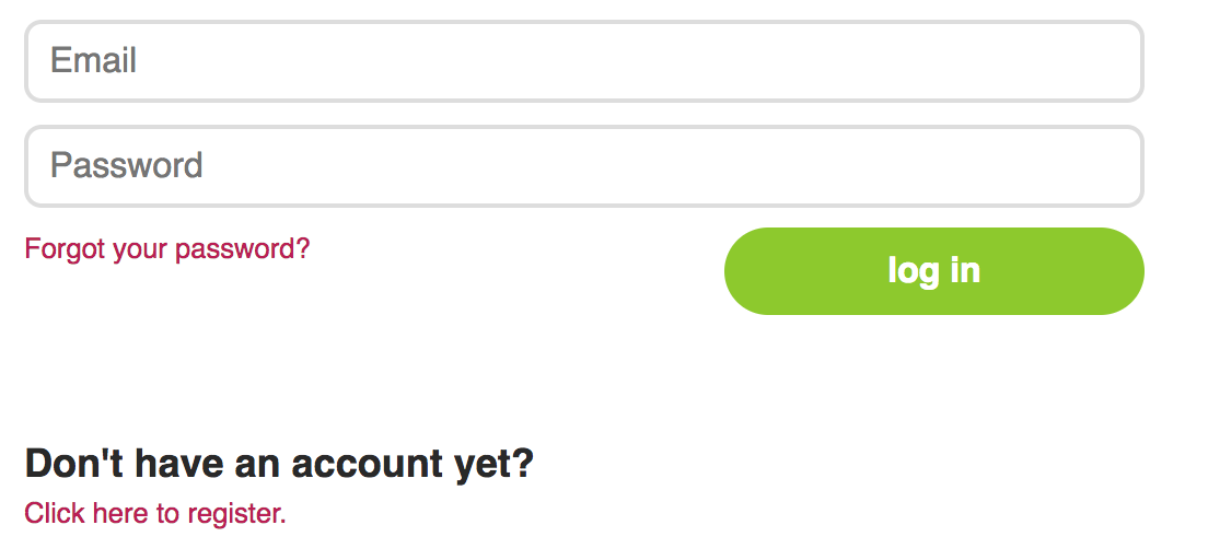
Login Screen
Your app’s login screen will consist of the following elements:
|
The two assets you will need to provide are:
- Background color/image
- Login graphic
App Customization and Image Dimensions
Login Screen
Alternative layouts
With ReactJS, you can explore alternative layouts for the Login screen for both desktop and mobile, such as the examples below. Speak to your Project Manager if you would like to explore these options.
App Customization and Image Dimensions
Login Screen
Background color/image
Because the background image will be used for both desktop and mobile, you will need to provide the background image for the biggest screen size possible – desktop.
For the background, you can either use a flat color or image.
Flat color If you are using a flat color, all you will need to provide is the hex code of the color. You will need to make sure that this color provides a good contrast to the rest of the elements that will sit on the login screen (text, buttons, login fields). | Image If you are using an image, you will need to prepare the image for HDTV resolution (1920Wx1080H). Any image you provide in a smaller resolution will result in the background image being pixelated. Therefore, if you are unable to provide an image in the specified size, we recommend to simply go with a flat color. If possible, provide the working file (.EPS or .AI format) so we can make minor adjustments as needed. |

App Customization and Image Dimensions
Login Screen
Background color/image guidelines
Do keep the background as simple as possible so it doesn’t obstruct the login text and fields.
Your design must also work when scaled down to mobile.
App Customization and Image Dimensions
Login Screen
Login Screen: Background color/image
Login Screen Background | ||
Description | File Name | Dimension WxH (px) |
HDTV Screen Background | login_bg.png login_bg.eps | 1920x1080 |
[appname]\react |
App Customization and Image Dimensions
Login screen
Login screen: Login graphic
This is the graphic that will sit on top of the login fields on your login screen.
This can be your campaign’s logo, or the mascot, or another flagship graphic. As it will sit on top of the background color, prepare this graphic as a PNG with a transparent background.
Otherwise, you can provide the working file for this (.AI or .EPS format).
Login Graphic | ||
Description | File Name | Dimension WxH (px) |
Login Graphic | login_graphic.png login_graphic.eps | Not specified, recommended size of 640x640* |
*No specific size. Recommended minimum size of 512Wx512H. To ensure compatibility with the background color, save the Login Graphic as a PNG with a transparent background.
[appname]\react |
App Customization and Image Dimensions
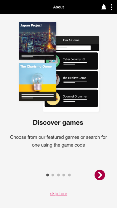
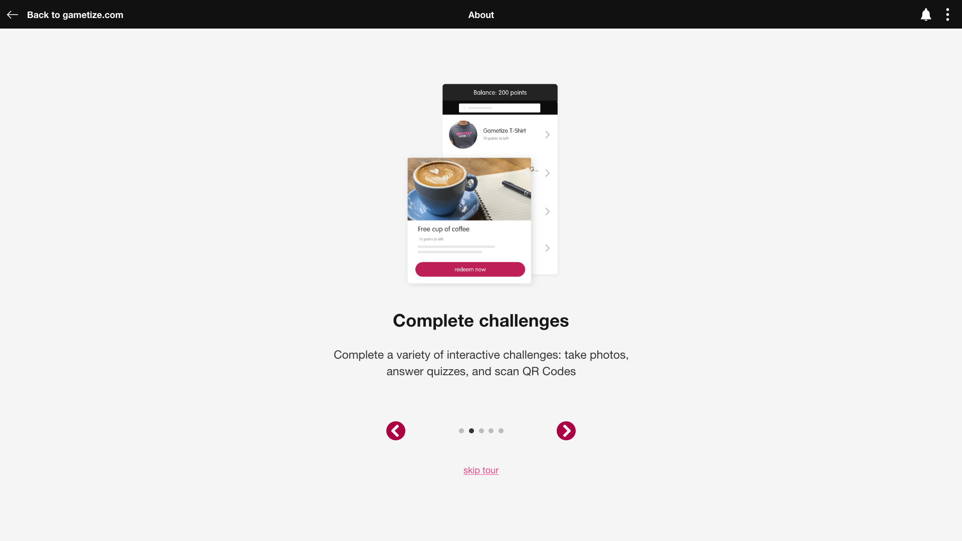
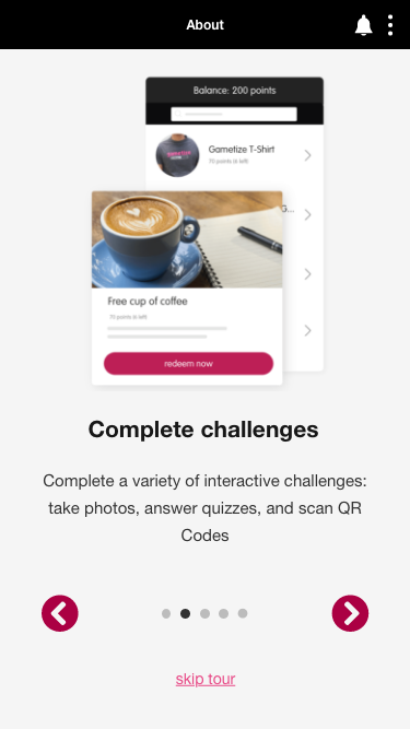
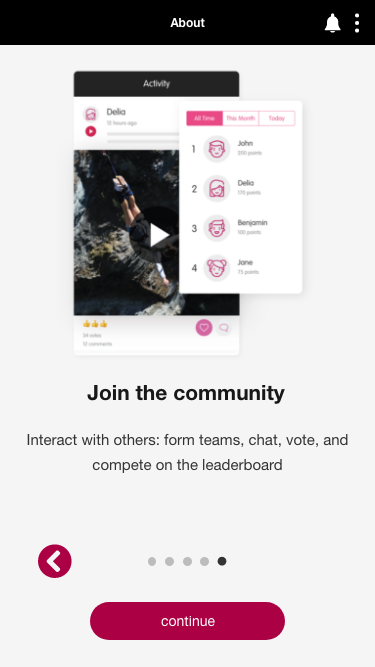
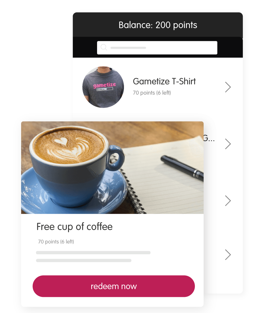
(Optional) Tour Screens
The Tour is where you onboard your user to your game(s). The Tour screens are optional: if you do not have tour screens, your app will load straight into the Home screen.
The Tour screens will be accessible:
- Upon the first time logging in, AND
- By clicking the “About” button in the top right corner of the topbar.
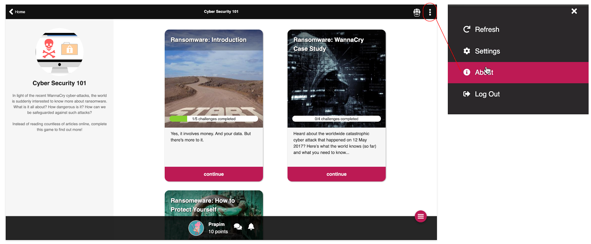
(Desktop) The Tour screens are accessible by clicking the “About” button in the top navigation bar after login.
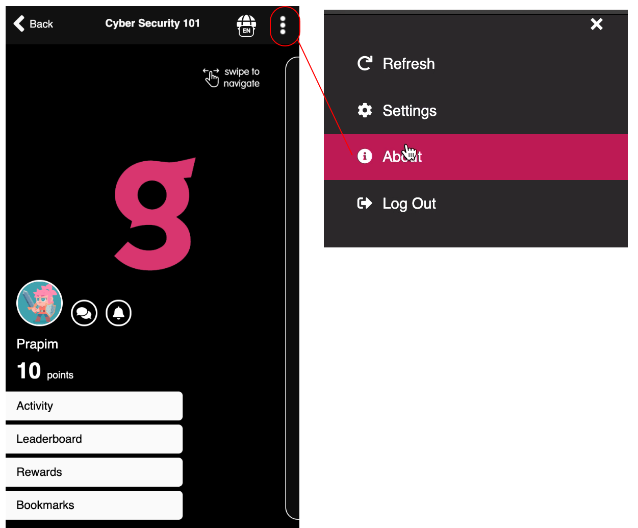
(Mobile) The Tour screens are accessible by clicking the “About” button in the top navigation bar after login.
App Customization and Image Dimensions
(Optional) Tour Screens
NOTE: In React, the number of tour screens can be configured easily. Do note the template provided is for a tour that is five screens. Here’s a recommended flow for designing your tour for five screens:
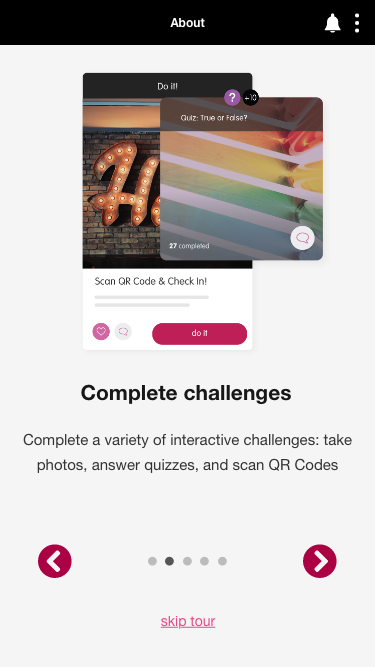
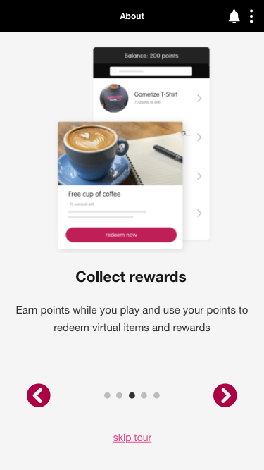
(from left to right) (1): Introducing the app; (2) Notable game mechanic; (3) Notable game mechanic;
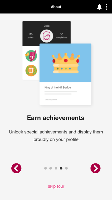

(from left to right) (4) Additional information; (5) Additional information & ending the Tour.
App Customization and Image Dimensions
(Optional) Tour Screens
Tour background color/image
For your convenience, we will choose the colors for your tour screen background and other assets, such as buttons, based on the colors in the rest of your app.
However, if you have a specific color scheme in mind for the Tour Screens, we have prepared a mockup of the Tour screens for you to customize the colors. Please ask your Gametize representative if you do not have this document.
App Customization and Image Dimensions
(Optional) Tour Screens
(Optional) Tour graphics
This is the graphic that will sit on the tour screens. As it will sit on top of the background color, prepare this graphic as a PNG with a transparent background.
Otherwise, you can provide the working file for this (.AI or .EPS format).
Login Graphic | ||
Description | File Name | Dimension WxH (px) |
Tour Graphic | tour_graphic_01.png tour_graphic_02.png tour_graphic_03.png tour_graphic_04.png tour_graphic_01.eps tour_graphic_04.eps | 640x640 |
[appname]\react |
App Customization and Image Dimensions
(Multi-Project Apps only) Masters Screen
If your app houses multiple Projects, you will have a Masters screen with a list of all your Projects. No customizations are needed for this screen.
App Customization and Image Dimensions
Home Screen (Desktop)
This is the Project View where Players can navigate to different parts of the game. You are able to customize the color palette of this page on desktop. To take a look at the default colors, you can check out our game Amazing Food Race on app.gametize.com and compare with the same game when white-labeled, Gourmet Grammar on gourmetgrammar.gametize.com.
Default colors: Amazing Food Race (Singapore Edition)
Customized colors: Gourmet Grammar
If you wish to change the colors of these elements, you will need to provide us with the hex color code of the customized color.
Link: #bc1954 (dark pink) | |
Topbar Background: #292929 (dark gray) (Depending on the color you choose, the topbar text will either be black or white, depending on which one provides a better contrast) | |
Sidebar Background (web only): #f6f6f6 (light gray) (Depending on the color you choose, the topbar text will either be black or white, depending on which one provides a better contrast) (Note: This sidebar will only appear on web and not on mobile) | |
Action Button: #85d02f (green) | |
Hamburger menu icon: #bc1954 (pink) (We recommend to use the topbar menu color or another similar color to retain consistency) | |
Pull-right menu: #282828 (dark gray) |
Home Screen (Mobile)
On mobile, the home screen design varies significantly from the desktop version.
Home Screen (Mobile)
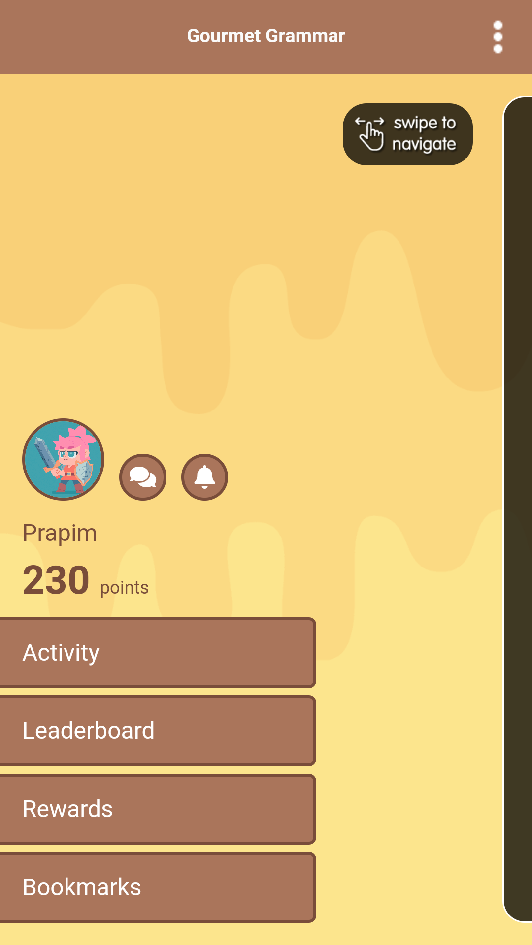
On mobile, the Home screen contains:
Background
| |
Topbar
| |
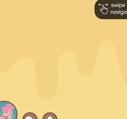
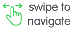
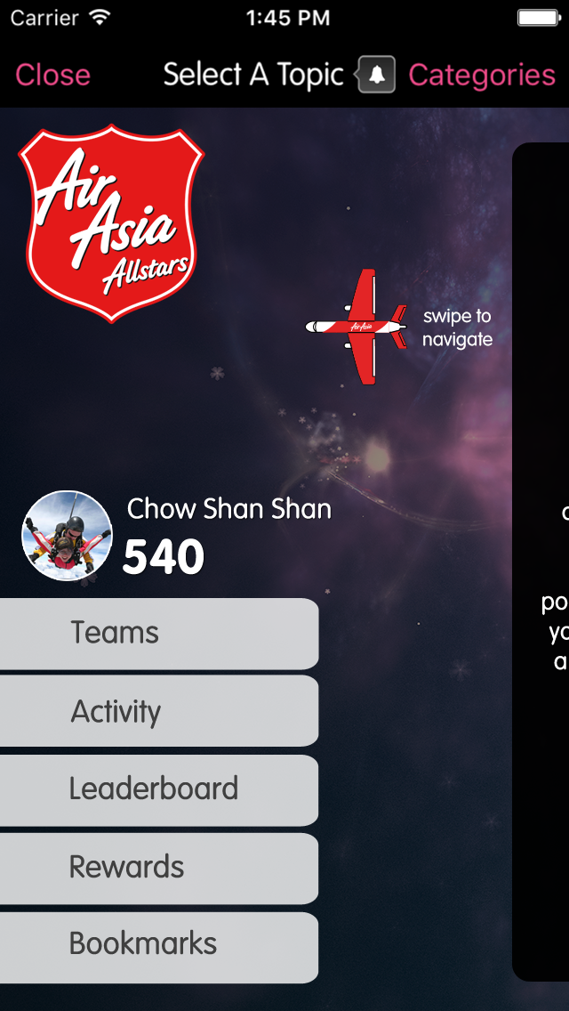
Swipe to navigate button | |
Player profile
| |
Home screen buttons
|
App Customization and Image Dimensions
Home Screen (Mobile)
Background color/image
For the background, you can either use a flat color or image.
Flat color If you are using a flat color, all you will need to provide is the hex code of the color. You will need to make sure that this color provides a good contrast to the rest of the elements that will sit on the login screen (text, buttons, login fields). | Image If you are using an image, you will need to prepare the image for HDTV resolution (1920Wx1080H). Any image you provide in a smaller resolution will result in the background image being pixelated. Therefore, if you are unable to provide an image in the specified size, we recommend to simply go with a flat color. If possible, provide the working file (.EPS or .AI format) so we can make minor adjustments as needed. |
App Customization and Image Dimensions
Home Screen (Mobile)
Background color/image
Login Screen Background | ||
Description | File Name | Dimension WxH (px) |
Home Background (Mobile) | home_bg.png home_bg.eps | 1280x1280 |
[appname]\react |
App Customization and Image Dimensions
Home Screen (Mobile)
Swipe to navigate button (optional)
The swipe to navigate button has a default design, but can be given a custom design.
Default design
Swipe Button | ||
Description | File Name | Dimension WxH (px) |
Swipe to navigate button | home_btn_play.png home_btn_play.eps | 160x67 |
[appname]\react |
App Customization and Image Dimensions
Other Assets
Android Feature Graphic
This is the banner in the Android store. This is the image the user will see when they view the app page in the Google Play store. At a glance, the Feature Graphic should give the impression of the app you wish to convey to potential users. |
Do NOT TinyPNG this feature graphic.
Here are some examples of Android feature graphics:
https://incipia.co/post/app-marketing/google-play-feature-graphic-ideas/
Android Feature Graphic | ||
Description | File Name | Dimension WxH (px) |
Feature Graphic | [app_name]_featuregraphic.png | 1024x500 |
[appname]\android |
FAQs
Are fonts customizable?
It is possible to choose your own font; however, as we have designed the specifications of our platform to suit Helvetica, changing the font may cause alignment issues. We will not be able to fix alignment issues that arise if you use a different font.
When choosing a custom font, use a Google font so that this font can be displayed across a variety of devices and browsers.
What else is customizable?
Other than what is listed in this guide, there are other elements that may be customizable depending on the timeline and service hours available to you.
Some customizations are not recommended as they may affect app scalability and stability, and result in bugs or other unintended behavior.
Please contact your Project Manager to discuss the feasibility of customizations not listed here.
What else do I need to know?
Read the App Submission Guidelines! This will give you a good idea of the process we go through when submitting apps to the App Store and Play Store and also affects the branding of your white-label visual assets.
You should also download the React White-Label Templates folder. This folder consists of the working files for the visual assets that are needed.
(If we have not provided you with this document, let your Gametize representative know!)
Folder Organization Chart
iOS | ||
[appname]\iOS | ||
↳ [appname]\iOS\misc | icon_1024.png | 1024Wx1024H |
icon_180.png | 180Wx180H | |
icon_120_1.png | 120Wx120H | |
icon_120_2.png | 120Wx120H | |
icon_87.png | 87Wx87H | |
icon_80.png | 80Wx80H | |
icon_60.png | 60Wx60H | |
icon_58.png | 58Wx58H | |
icon_40.png | 40Wx40H | |
1x.png | 320Wx480H | |
2x_1.png | 640Wx960H | |
2x_2.png | 640Wx960H | |
retina4_1.png | 640Wx1136H | |
retina4_2.png | 640Wx1136H | |
4_7inch.png | 750Wx1334H | |
x.png | 1125Wx2436H | |
5_5inch.png | 1242Wx2208H | |

Android | ||
[appname]\android | launcher.png | 512xWx512H |
[appname]_featuregraphic.png | 1024Wx500H | |
↳ [appname]\android\drawable-xxxhdpi | launcher.png | 192Wx192H |
launch.png | 1280Wx1920H | |
↳ [appname]\android\drawable-xxhdpi | launcher.png | 144Wx144H |
launch.png | 900Wx1600H | |
↳ [appname]\android\drawable-xhdpi | launcher.png | 96Wx96H |
launch.png | 720Wx1230H | |
↳ [appname]\android\drawable-hdpi | launcher.png | 72Wx72H |
launch.png | 540Wx923H | |
↳ [appname]\android\drawable-mdpi | launcher.png | 48Wx48H |
launch.png | 360Wx615H | |
React | ||
[appname]\react | login_graphic.png login_graphic.eps | Minimum of 512Wx512H, but no fixed size |
login_bg.png login_bg.eps | 1920Wx1080H | |
home_bg.png home_bg.eps | 1280Wx1280H | |
home_btn_play.png home_btn_play.eps | 160Wx67H | |
tour_graphic_01.png tour_graphic_02.png tour_graphic_03.png tour_graphic_04.png tour_graphic_01.eps tour_graphic_04.eps | 640Wx640H | |
Resources
General
- More about ReactJS: https://codeburst.io/what-is-reactjs-and-how-can-make-your-life-easier-3beb797f30e4
- Compressing .png files: http://tinypng.org
- Filename extension conventions: https://en.wikipedia.org/wiki/Filename#Filename_extensions
- Launch screen examples: http://appdevelopment.daffodilsw.com/blog/25-best-splash-screen-examples-for-mobile-apps
- White-label templates: https://corp.gametize.com/white-label
- App icon examples: http://iosicongallery.com
- Website dimensions: https://websitedimensions.com
iOS
- Guide to iOS app icons: https://developer.apple.com/library/ios/qa/qa1686/_index.html
Android
- Creating Android icons: https://iconhandbook.co.uk/reference/chart/android/
- Examples of Android feature graphic: https://incipia.co/post/app-marketing/google-play-feature-graphic-ideas/