
White-Label Design Guide 2020
Prepared by: Prapim Chutaprutikorn
Last updated: July 2020
How to use this Guide
Use this guide to familiarize yourself with how to create and prepare visual assets for a white-label app. Use this in conjunction with the white-label templates and white-label app details form.
Table of Contents
How to organize and name files 9
Typography (FYI: For mockups only) 11
Buttons & links (FYI: For mockups only) 11
Workflow of Customizable Screens 12
App Customization and Image Dimensions 13
(Multi-Project Apps only) Masters Screen 43
White-Label References
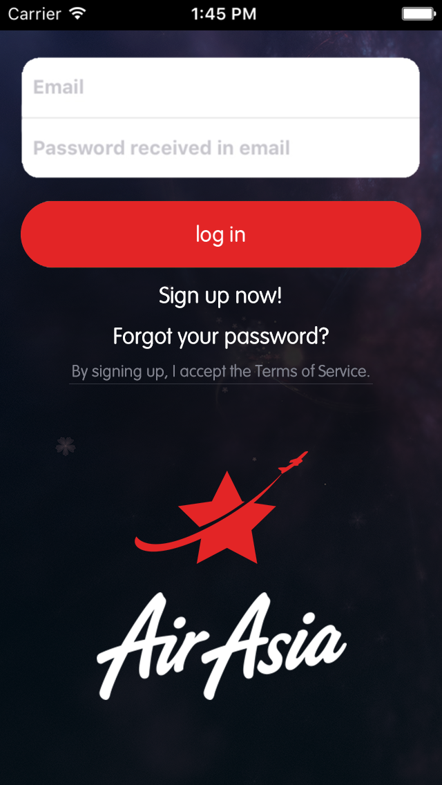
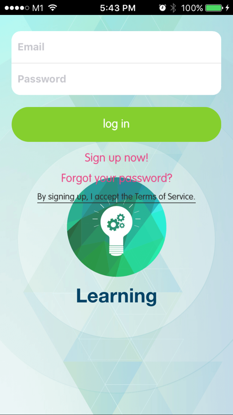
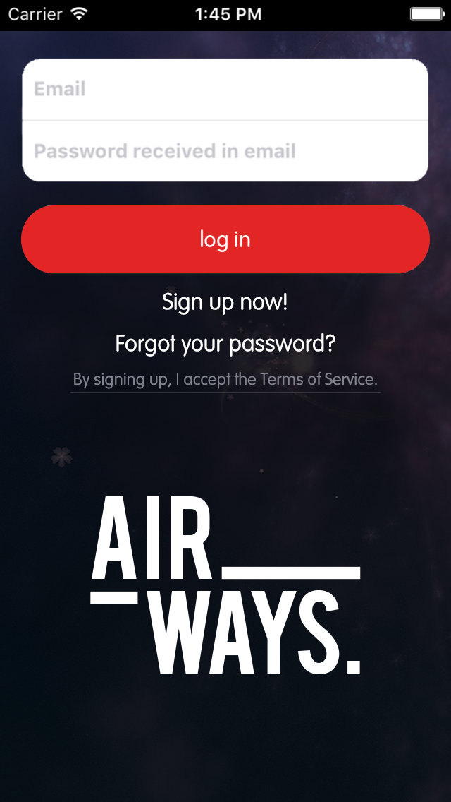
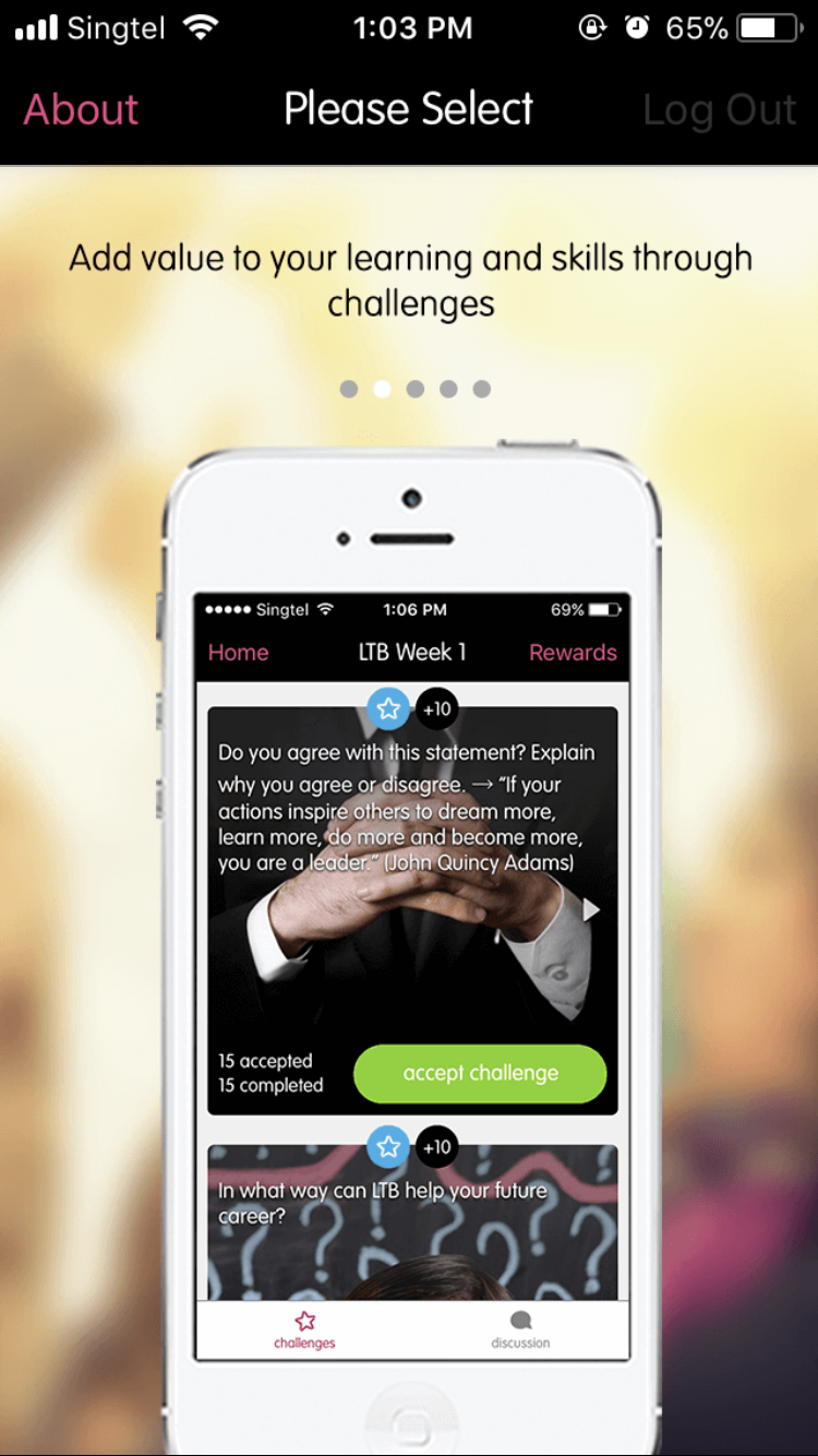
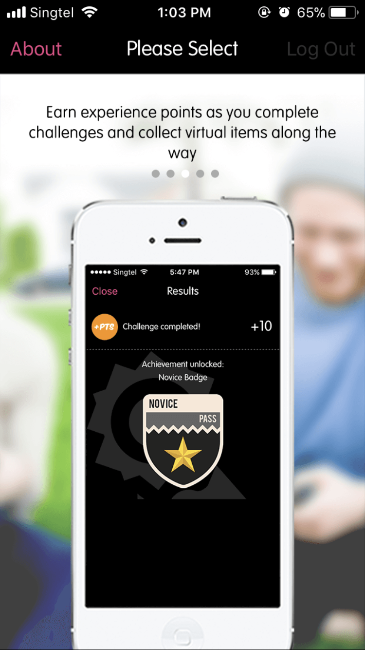
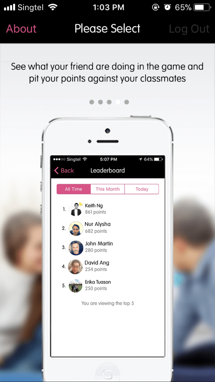
Download some of our white-label apps to get a better idea of how your customizations might look. Here are some of our selected apps for you to try:
Selfiely Selfiely is the ultimate app that challenges you to take fun selfies! [iOS] | |
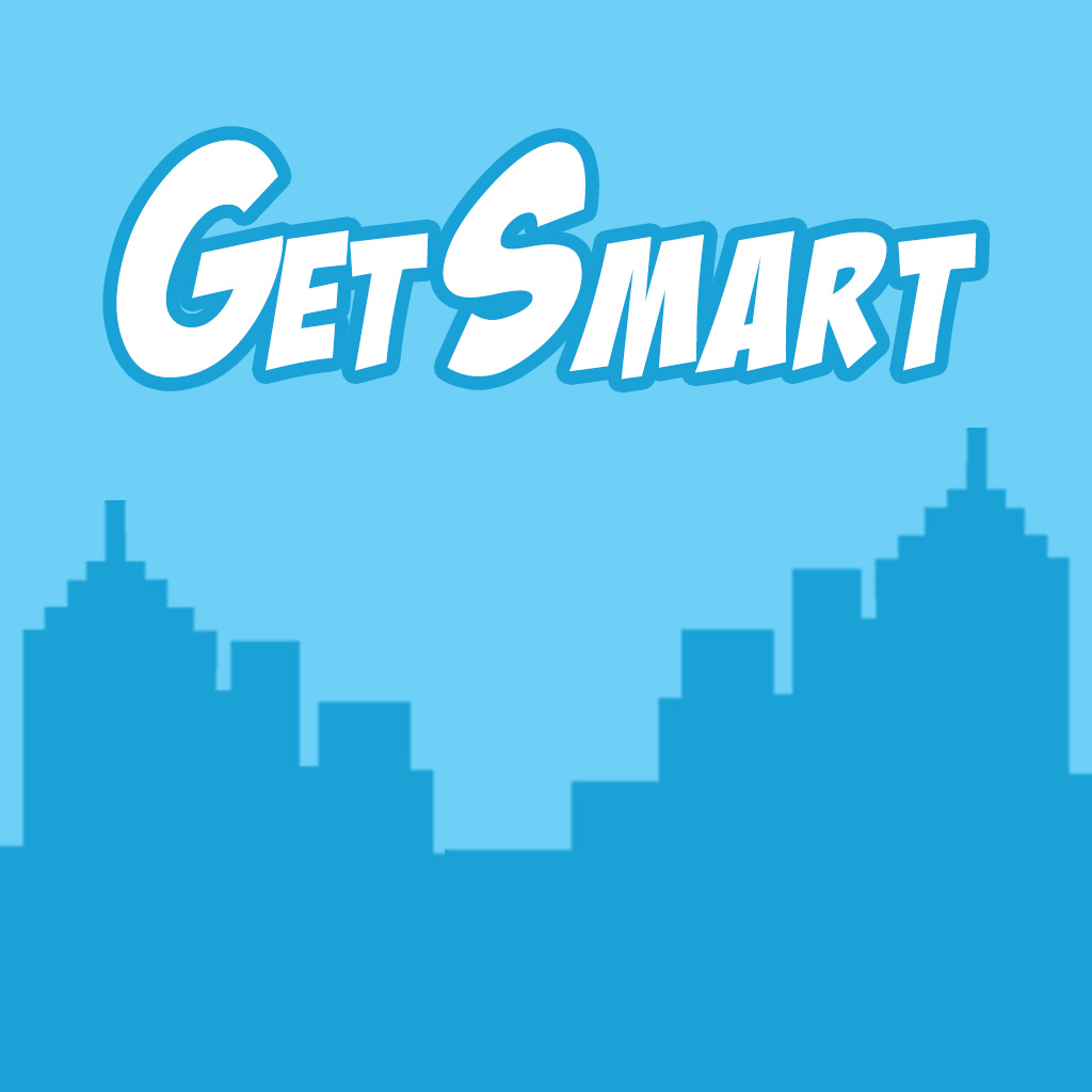
GetSmart English The perfect app to master English for work for Chinese speakers. |

Designing for iOS & Android
Screen sizes
Your design should be versatile enough to accommodate a variety of screen sizes on iOS and Android devices.
General rules of thumb:
- Positions of buttons and other interface elements are NOT absolute
The design (left) is intended to have the blue borders “outline” the buttons,
but on certain screens (right), the buttons will be misaligned to the design.
Designing for iOS & Android
Screen sizes
- Don’t place important elements outside of the “safe areas” – it may be cropped off. Safe areas will be clearly stated in each asset.
The logo is cropped off due to it being outside of the “safe area”.
Designing for iOS & Android
Screen sizes
- Make minor tweaks to optimize your designs for different screens.
For screens with a shorter height (left), the design is more concentrated (notice the logo and hero image are closer together).
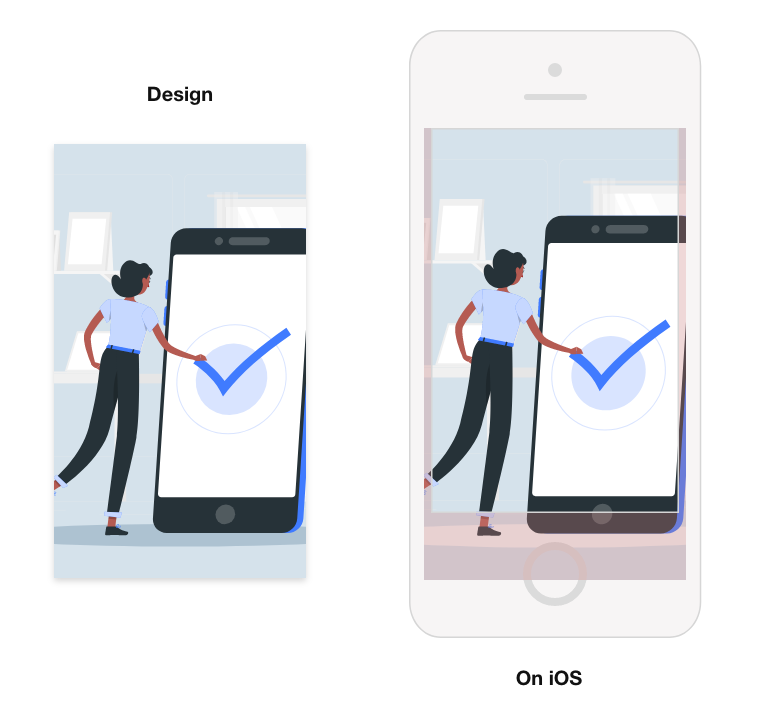
Designing for iOS
- Images that don’t fit in iOS devices are cropped from the bottom, unless specified.
- In some screens, the crop will be quite generous – do keep this in mind for your design.
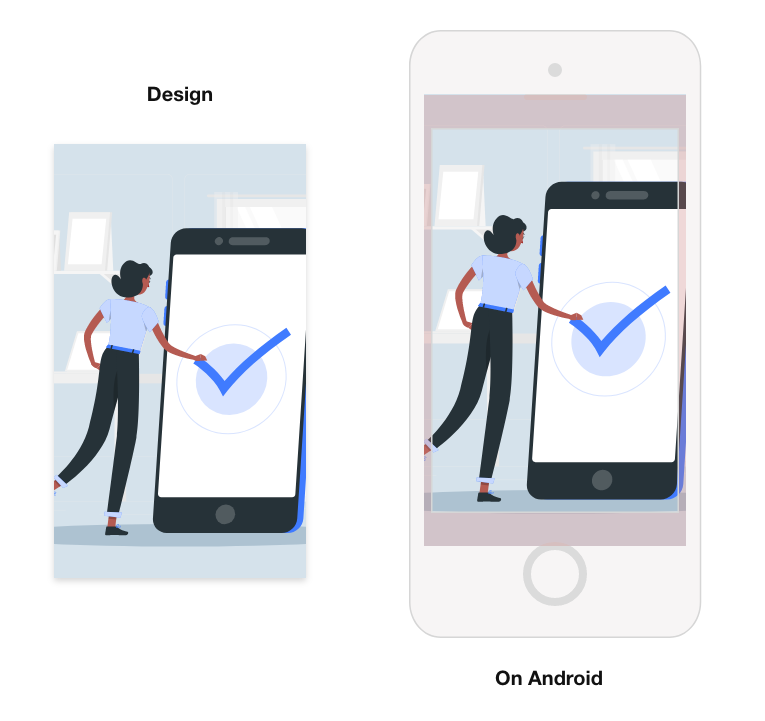
Designing for Android
- There are 5 dimensions:
- XXXHDPI
- XXHDPI
- XHDPI (extra high)
- HDPI (high)
- MDPI (medium)
- Images that don’t fit in Android devices are cropped to the centre (i.e. on all sides), unless specified.
Designing for iOS & Android
Saving image files
Follow these settings when saving your files:
- Export your files in PNG format
- Preserve transparency wherever needed
- Images should be in 72dpi ONLY
- Image colors should be in RGB ONLY
- Ensure dimensions are exact
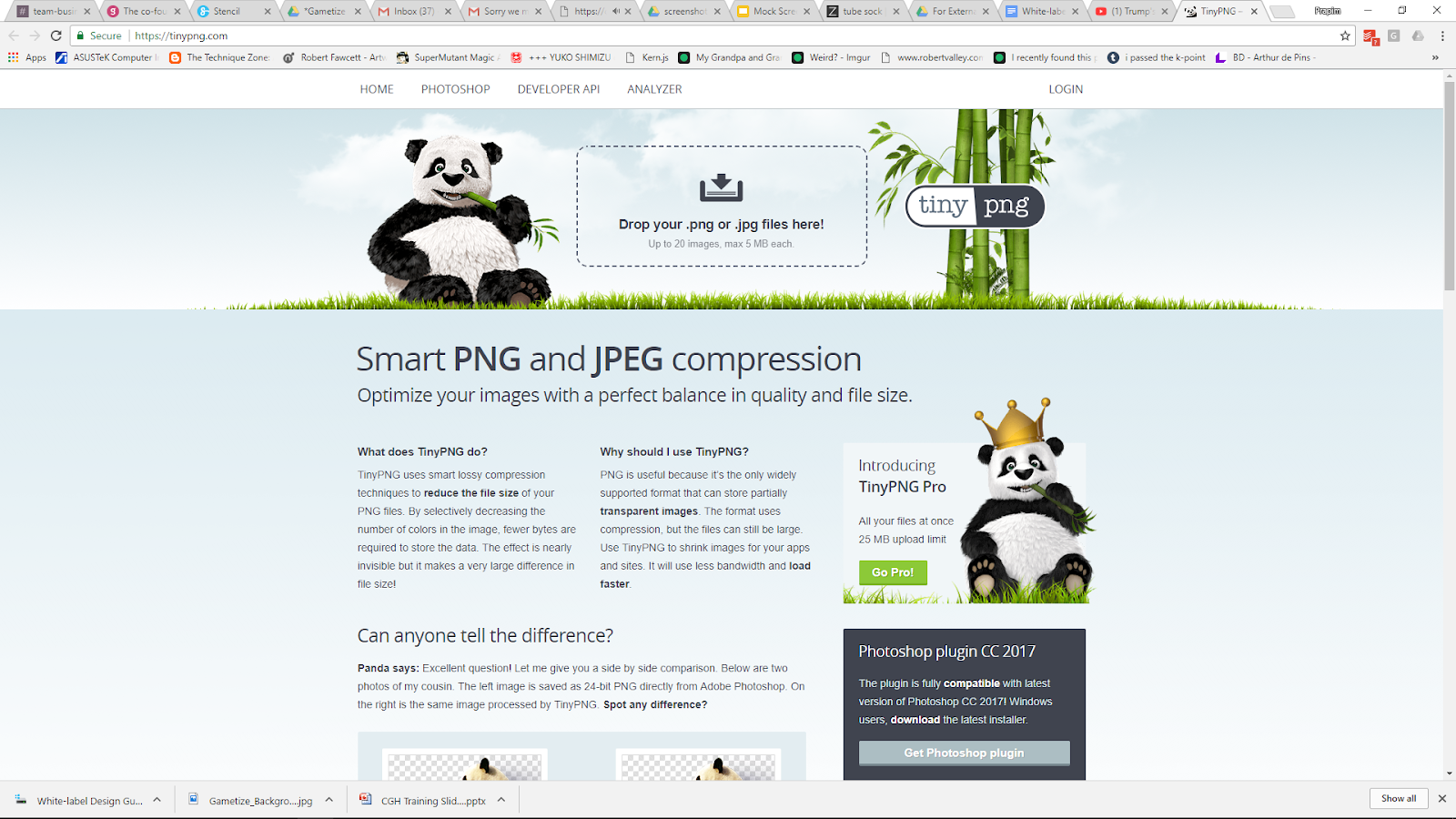
- Optimize & compress your files using a compressor tool, such as TinyPNG
TinyPNG (http://tinypng.org) will help speed up the app’s loading time with no significant decrease in image quality.
Compress all designs, EXCEPT:
- App Icon
- Android Download Icon
- Android Feature Graphic


Uncompressed (left) vs. Compressed (right). There is no significant change in quality,
but the file size has been reduced from 647.5KB to 193.2KB, a 70% decrease. Wowza!
Designing for iOS & Android
How to organize and name files
It’s important to organize and name your files correctly. Please follow the naming convention indicated at the end of each asset.
[appname]\iOS\misc |
For XXXHDPI: [appname]\android\drawable-xxxhdpi For XXHDPI: [appname]\android\drawable-xxhdpi For XHDPI: [appname]\android\drawable-xhdpi For HDPI: [appname]\android\drawable-hdpi For MDPI: [appname]\android\drawable-mdpi |
Rules of thumb:
- Follow the conventions exactly – even the capitalization and the spacings
- If your app name has special characters, omit them in your folder names.
Consult this wiki for a list of special characters (not exhaustive): https://en.wikipedia.org/wiki/Filename#Filename_extensions
(e.g. If your app name is “Connect & Play”, your folder name should be a similar variation such as “connectplay”, “connect-play”, “connect-and-play”, etc.)
Designing for iOS & Android
Color code
Android
Android uses HEX color code, which can be easily retrieved from Photoshop/Illustrator/InDesign’s color picker under the # box.
Alternatively, you can also pick colors from this website: https://htmlcolorcodes.com
Use the color picker tool in Photoshop to pick out the HEX color code.
iOS
RGB values are converted to float value in iOS. This is the original RGB values divided by 255. However, provide the color to us in HEX value and we will do the conversion for you.
For example If your chosen color is R(231) G(0) B(141) Calculate the float value by dividing each number by 255. R: 231 ÷ 255 = 0.905 G: 0 ÷ 255 = 0 B: 141 ÷ 255 = 0.552 The float value is R(0.905) G(0) B(0.552) |
Designing for iOS & Android
Typography (FYI: For mockups only)
We use VAG Rounded as our white-label app typeface. You can download the font for mockup purposes here: https://www.wfonts.com/font/vagrounded |
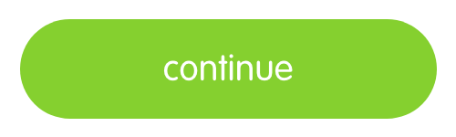
Buttons & links (FYI: For mockups only)
All buttons in the app are now created using CSS so there is no need for button designs. You can customize the color of the call to action buttons and hyperlinks.
Call to action buttons
| Hyperlinks
|


Workflow of Customizable Screens
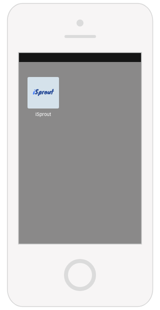
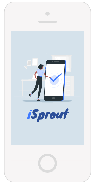
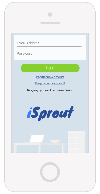
1. Launch app via App Icon | 2. Launch screen when app is loading | 3. Login screen, where user can sign in using email or register for a new account |


4. (Optional) Tour screens appear after login | 5. (If your app is multi-Project) Masters screen showing all Projects | 6. Home screen where the Player can access different parts of the game, such as Rewards, Points, and Challenges. |
App Customization and Image Dimensions
Customizable elements are the front-facing screens, i.e. what the user will interact with before they get to the game contents. You should apply your branding consistently throughout these elements.
At a glance, these elements are:
- App Icon
- Launch Screen
- Login Screen
- (Optional) Tour Screen
- (Multi-Project apps only) Masters Screen
- Home Screen
- Android-specific images
App Customization and Image Dimensions
App Icon
The design of the App Icon should be as simple and scalable as possible because it will be shown in very small sizes.
Important!
Do not TinyPNG the App Icons. (This will make the App Icons look pixelated.)
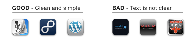
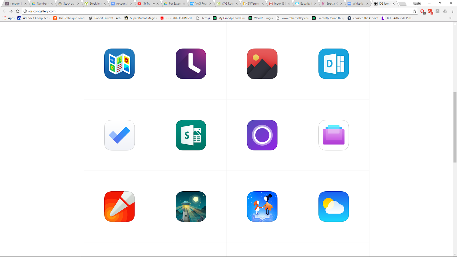
Visit http://iosicongallery.com for inspiration in designing the App Icon.
App Customization and Image Dimensions
App Icon (iOS)
You do not need to save the image with a rounded border because Xcode will be doing it for you.
Visit https://developer.apple.com/library/ios/qa/qa1686/_index.html for more information about iOS app icons.
iOS App Icon | ||
Description | File Name | Dimension WxH (px) |
App Store icon | icon_1024.png | 1024x1024 |
icon_180.png | 180x180 | |
icon_120_1.png | 120x120 | |
icon_120_2.png | 120x120 | |
icon_87.png | 87x87 | |
icon_80.png | 80x80 | |
icon_60.png | 60x60 | |
icon_58.png | 58x58 | |
icon_40.png | 40x40 | |
[appname]\iOS\misc |
App Customization and Image Dimensions
App Icon (Android)
For the Play Store icon, you do not need to save the image with a rounded border because Google Play will dynamically handle masking to be approximately 20% of the icon size.
This does not apply to the XXXHDPI, XXHDPI, XHDPI, HDPI, and MDPI app icons. For these icons, the rounded corners must be applied during the image creation.
Visit https://developer.android.com/google-play/resources/icon-design-specifications for more information about Android app icons.

Android App Icon | ||
Description | File Name | Dimension WxH (px) |
Play Store icon | launcher.png | 512x512 |
XXXHDPI | launcher.png | 192x192 With 27px rounded corner radius |
XXHDPI | launcher.png | 144x144 |
XHDPI | launcher.png | 96x96 |
HDPI | launcher.png | 72x72 |
MDPI | launcher.png | 48x48 |
For the Play Store icon: [appname]\android For XXXHDPI: [appname]\android\drawable-xxxhdpi For XXHDPI: [appname]\android\drawable-xxhdpi For XHDPI: [appname]\android\drawable-xhdpi For HDPI: [appname]\android\drawable-hdpi For MDPI: [appname]\android\drawable-mdpi |
App Customization and Image Dimensions
Launch Screen
A Launch screen is the “splash screen” that displays when your app starts up.
This will only be shown on the screen for a few seconds, so keep it minimal. Usually just these elements are enough:

- Background colour/image
- Logo
- (Optional) Feature image
- (If partnership app) “Powered by Gametize”
To give the impression that the app loads up faster and to achieve a more seamless experience in the screen transition, you can design a Launch screen that is similar to the first screen of the Login screen.
Here are some examples of launch screens: http://appdevelopment.daffodilsw.com/blog/25-best-splash-screen-examples-for-mobile-apps
App Customization and Image Dimensions
Launch Screen (iOS)
iOS Launch Screen | ||
Description | File Name | Dimension WxH (px) |
iOS Launch screen | 1x.png | 320x480 |
2x_1.png | 640x960 | |
2x_2.png | 640x960 | |
retina4_1.png | 640x1136 | |
retina4_2.png | 640x1136 | |
4_7inch.png | 750x1334 | |
x.png | 1125x2436* | |
5_5inch.png | 1242x2208 | |
[appname]\iOS\misc |
App Customization and Image Dimensions
Launch Screen (iOS)
iOS Launch Screen | ||
Description | File Name | Dimension WxH (px) |
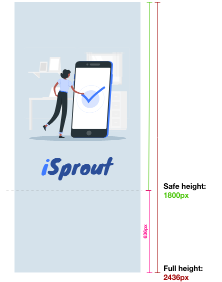
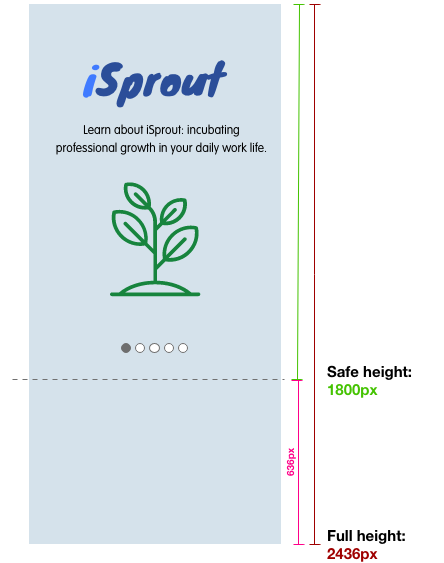
x.png | 1125x2436** | |
*Take care to adhere to the following guidelines, as this asset has a generous crop on some devices.
The dashed line indicates the safe area for the design. Place all important elements above the Safe height area –
|
App Customization and Image Dimensions
Launch Screen (Android)
Android Launch Screen | ||
Description | File Name | Dimension WxH (px) |
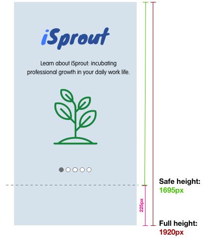
XXXHDPI | launch.png | 1280x1920 |
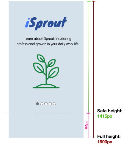
XXHDPI | launch.png | 960x1600 |
XHDPI | launch.png | 720x1230 |
HDPI | launch.png | 540x923 |
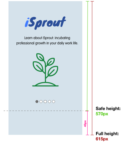
MDPI | launch.png | 360x615 |
For XXXHDPI: [appname]\android\drawable-xxxhdpi For XXHDPI: [appname]\android\drawable-xxhdpi For XHDPI: [appname]\android\drawable-xhdpi For HDPI: [appname]\android\drawable-hdpi For MDPI: [appname]\android\drawable-mdpi |
App Customization and Image Dimensions
Login Screen
Your app’s login fields will include:
|
These fields are positioned at the top of the screen so your Login screen design should accommodate the space needed for the login fields. Any important elements should be confined to the bottom third of your screen – exact dimensions will be specified in each asset.
Be mindful any important elements in your design are not obscured by the login fields – compare the two examples.
App Customization and Image Dimensions
Login screen (iOS)
iOS Login Screen | ||
Image is aligned to top when cropped to different phone sizes, so give space allowance on left, right and bottom padding when creating the iOS Login Screen images. | ||
Description | File Name | Dimension WxH (px) |
Login screen @ 1x | signin_bg.png | 320x568* |
Login screen @ 2x | signin_bg@2x.png | 640x1386** |
Login screen @ 3x | signin_bg@3x.png | 1125x2436*** |
[appname]\iOS\loginview |
App Customization and Image Dimensions
Login Screen (iOS)
iOS Login Screen | ||
Description | File Name | Dimension WxH (px) |
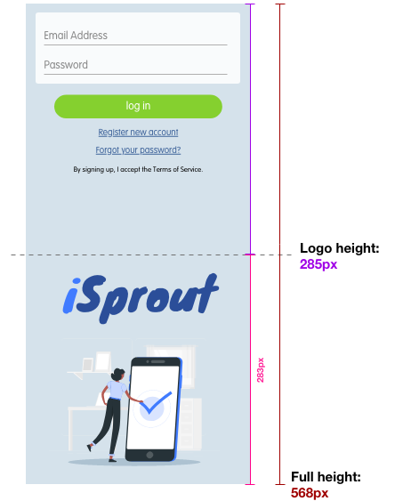
Login screen | signin_bg.png | 320x568* |
*Take care to adhere to the following guidelines, as this asset has a generous crop on some devices.
The dashed line indicates the safe area for the design. Place all important elements below the Logo height –
|
App Customization and Image Dimensions
Login Screen (iOS)
iOS Login Screen | ||
Description | File Name | Dimension WxH (px) |
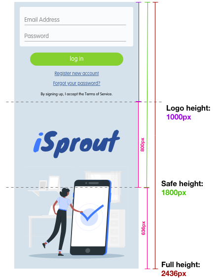
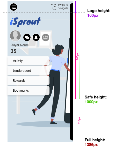
Login screen @ 2x | signin_bg@2x.png | 640x1386** |
**Take care to adhere to the following guidelines, as this asset has a generous crop on some devices.
The dashed line indicates the safe area for the design. Place all important elements between the Logo height and Safe height area –
|

App Customization and Image Dimensions
Login Screen (iOS)
iOS Login Screen | ||
Description | File Name | Dimension WxH (px) |
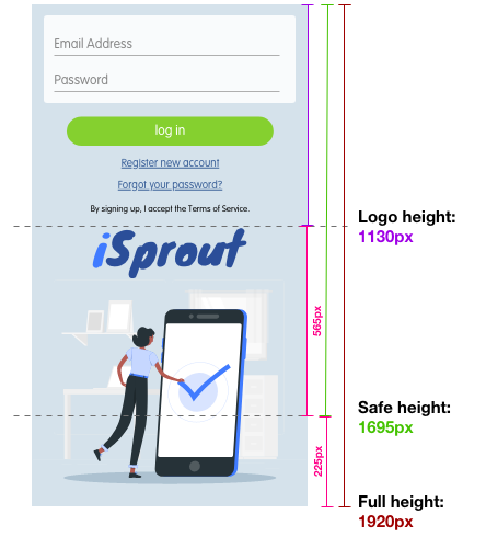
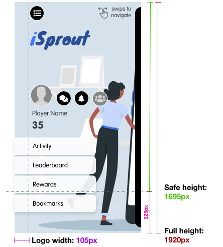
Login screen @ 3x | signin_bg@3x.png | 1125x2436*** |
***Take care to adhere to the following guidelines, as this asset has a generous crop on some devices.
The dashed line indicates the safe area for the design. Place all important elements between the Logo height and Safe height area –
|
App Customization and Image Dimensions
Login Screen (Android)
Android Login Screen | ||
Description | File Name | Dimension WxH (px) |
XXXHDPI | login_bg.png | 1280x1920a |
XXHDPI | login_bg.png | 960x1600b |
XHDPI | login_bg.png | 720x1230c |
HDPI | login_bg.png | 540x923d |
MDPI | login_bg.png | 360x615e |
For XXXHDPI: [appname]\android\drawable-xxxhdpi For XXHDPI: [appname]\android\drawable-xxhdpi For XHDPI: [appname]\android\drawable-xhdpi For HDPI: [appname]\android\drawable-hdpi For MDPI: [appname]\android\drawable-mdpi |
App Customization and Image Dimensions
Login Screen (Android)
Android Login Screen | ||
Description | File Name | Dimension WxH (px) |
XXXHDPI | login_bg.png | 1280x1920a |
aTake care to adhere to the following guidelines, as this asset has a generous crop on some devices.
The dashed line indicates the safe area for the design. Place all important elements between the Logo height and Safe height area –
|
App Customization and Image Dimensions
Login Screen (Android)
Android Login Screen | ||
Description | File Name | Dimension WxH (px) |
XXHDPI | login_bg.png | 960x1600b |
bTake care to adhere to the following guidelines, as this asset has a generous crop on some devices.
The dashed line indicates the safe area for the design. Place all important elements between the Logo height and Safe height area –
|

App Customization and Image Dimensions
Login Screen (Android)
Android Login Screen | ||
Description | File Name | Dimension WxH (px) |
XHDPI | login_bg.png | 720x1230c |
cTake care to adhere to the following guidelines, as this asset has a generous crop on some devices.
The dashed line indicates the safe area for the design. Place all important elements between the Logo height and Safe height area –
|

App Customization and Image Dimensions
Login Screen (Android)
Android Login Screen | ||
Description | File Name | Dimension WxH (px) |
HDPI | login_bg.png | 540x923d |
dTake care to adhere to the following guidelines, as this asset has a generous crop on some devices.
The dashed line indicates the safe area for the design. Place all important elements between the Logo height and Safe height area –
|

Login Screen (Android)
Android Login Screen | ||
Description | File Name | Dimension WxH (px) |
MDPI | login_bg.png | 360x615e |
eTake care to adhere to the following guidelines, as this asset has a generous crop on some devices.
The dashed line indicates the safe area for the design. Place all important elements between the Logo height and Safe height area –
|

App Customization and Image Dimensions
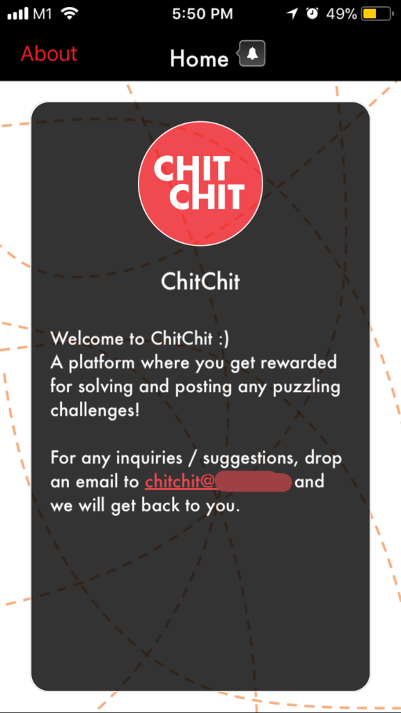
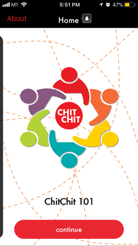
(Optional) Tour Screens
This part is where you introduce the user to your app, what it is, and how to use it. The Tour screens are optional: if you do not have tour screens, your app will load straight into the Home screen.
The Tour screens will be accessible:
- Upon logging in for the first time ONLY, OR
- iOS: By clicking the “About” button in the top left corner of the navigation bar.
- Android: By clicking the “Three dots” > “About” icon in the top right corner of the navigation bar.
The Tour screens are accessible by clicking the “About” button in the top navigation bar after login.

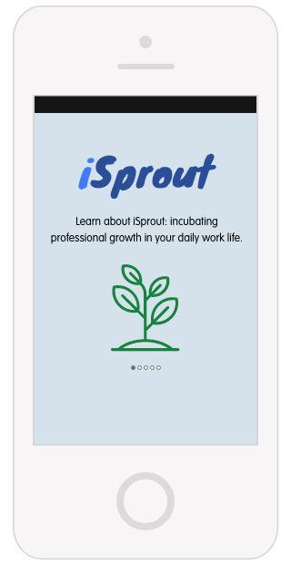
Here is an example of a Tour screenflow.
App Customization and Image Dimensions
Tour Screens
NOTE: Tour is fixed at five screens due to the way our app is programmed. Here’s a recommended flow for how you can design each of the five Tour screens:
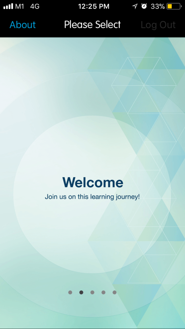
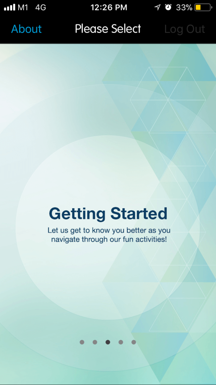
(from left to right) (1): Name of the app; (2) Welcome; (3) Getting started & introduction;
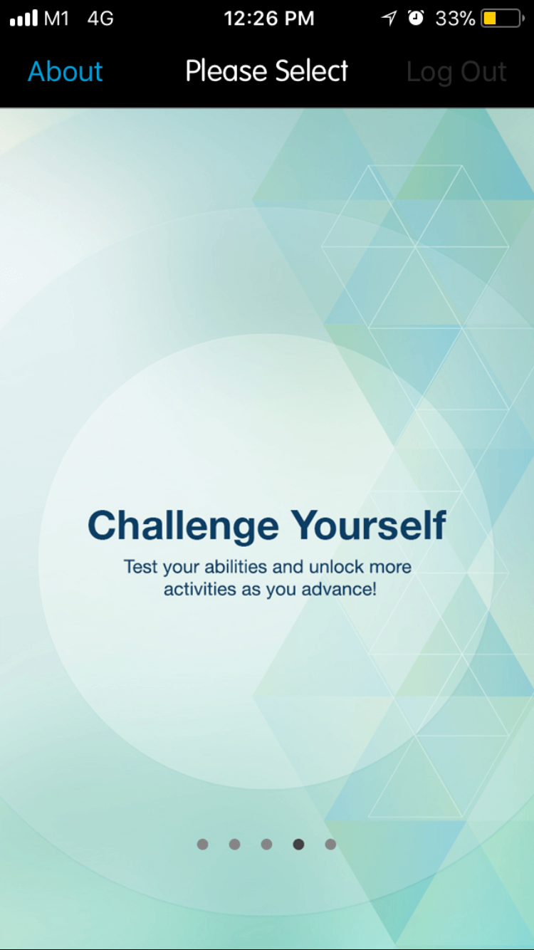
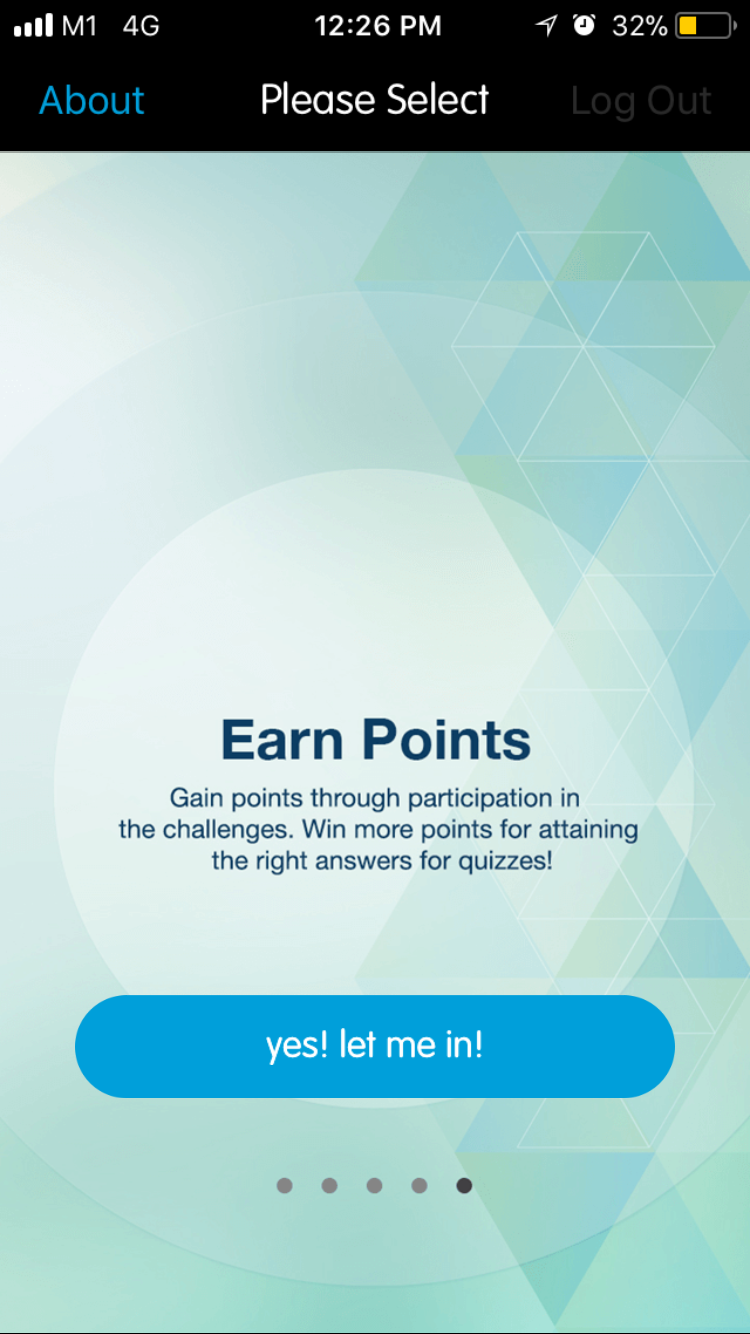
(from left to right) (4) Additional information; (5) Additional information & ending the Tour.
App Customization and Image Dimensions
Tour Screen (iOS)
iOS Tour Screen | ||
Image is aligned to top when cropped to different phone sizes, so give space allowance on left, right and bottom padding when creating the iOS Tour Screen images. | ||
Description | File Name | Dimension WxH (px) |
Tour screen @ 1x | coachmark1.png coachmark2.png coachmark3.png coachmark4.png coachmark5.png | 320x568 |
Tour screen @ 2x | coachmark1@2x.png coachmark2@2x.png coachmark3@2x.png coachmark4@2x.png coachmark5@2x.png | 640x1386* |
Tour screen @ 3x | coachmark1@3x.png coachmark2@3x.png coachmark3@3x.png coachmark4@3x.png coachmark5@3x.png | 1125x2436** |
[appname]\iOS\loginview |
App Customization and Image Dimensions
Tour Screen (iOS)
iOS Login Screen | ||
Description | File Name | Dimension WxH (px) |
Tour screen @ 2x | coachmark1@2x.png coachmark2@2x.png coachmark3@2x.png coachmark4@2x.png coachmark5@2x.png | 640x1386* |
*Take care to adhere to the following guidelines, as this asset has a generous crop on some devices.
The dashed line indicates the safe area for the design. Place all important elements above the Safe height area –
|

App Customization and Image Dimensions
Tour Screen (iOS)
iOS Login Screen | ||
Description | File Name | Dimension WxH (px) |
Tour screen @ 3x | coachmark1@3x.png coachmark2@3x.png coachmark3@3x.png coachmark4@3x.png coachmark5@3x.png | 1125x2436** |
**Take care to adhere to the following guidelines, as this asset has a generous crop on some devices.
The dashed line indicates the safe area for the design. Place all important elements above the Safe height area –
|
App Customization and Image Dimensions
Tour Screen (Android)
Android Tour Screen | ||
Description | File Name | Dimension WxH (px) |
XXXHDPI | tour1.png tour2.png tour3.png tour4.png | 1280x1920a |
XXHDPI | tour1.png tour2.png tour3.png tour4.png | 960x1600b |
XHDPI | tour1.png tour2.png tour3.png tour4.png | 720x1230c |
HDPI | tour1.png tour2.png tour3.png tour4.png | 540x923d |
MDPI | tour1.png tour2.png tour3.png tour4.png | 360x615e |
For XXXHDPI: [appname]\android\drawable-xxxhdpi For XXHDPI: [appname]\android\drawable-xxhdpi For XHDPI: [appname]\android\drawable-xhdpi For HDPI: [appname]\android\drawable-hdpi For MDPI: [appname]\android\drawable-mdpi |
App Customization and Image Dimensions
Tour Screen (Android)
Android Tour Screen | ||
Description | File Name | Dimension WxH (px) |
XXXHDPI | tour1.png tour2.png tour3.png tour4.png | 1280x1920a |
cTake care to adhere to the following guidelines, as this asset has a generous crop on some devices.
The dashed line indicates the safe area for the design. Place all important elements above the Safe height area –
|
App Customization and Image Dimensions
Tour Screen (Android)
Android Tour Screen | ||
Description | File Name | Dimension WxH (px) |
XXHDPI | tour1.png tour2.png tour3.png tour4.png | 960x1600b |
cTake care to adhere to the following guidelines, as this asset has a generous crop on some devices.
The dashed line indicates the safe area for the design. Place all important elements above the Safe height area –
|
App Customization and Image Dimensions
Tour Screen (Android)
Android Tour Screen | ||
Description | File Name | Dimension WxH (px) |
XHDPI | tour1.png tour2.png tour3.png tour4.png | 720x1230c |
cTake care to adhere to the following guidelines, as this asset has a generous crop on some devices.
The dashed line indicates the safe area for the design. Place all important elements above the Safe height area –
|

App Customization and Image Dimensions
Tour Screen (Android)
Android Tour Screen | ||
Description | File Name | Dimension WxH (px) |
HDPI | tour1.png tour2.png tour3.png tour4.png | 540x9232d |
dTake care to adhere to the following guidelines, as this asset has a generous crop on some devices.
The dashed line indicates the safe area for the design. Place all important elements above the Safe height area –
|

App Customization and Image Dimensions
Tour Screen (Android)
Android Tour Screen | ||
Description | File Name | Dimension WxH (px) |
MDPI | tour1.png tour2.png tour3.png tour4.png | 360x615e |
eTake care to adhere to the following guidelines, as this asset has a generous crop on some devices.
The dashed line indicates the safe area for the design. Place all important elements above the Safe height area –
|
App Customization and Image Dimensions
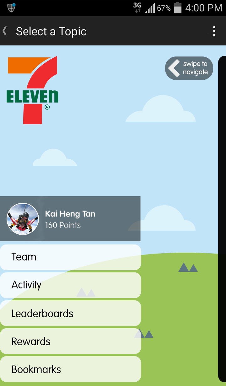
(Multi-Project Apps only) Masters Screen
If your app houses multiple Projects, you will have a Masters screen with a list of all your Projects.
No customizations are needed for this screen.
App Customization and Image Dimensions
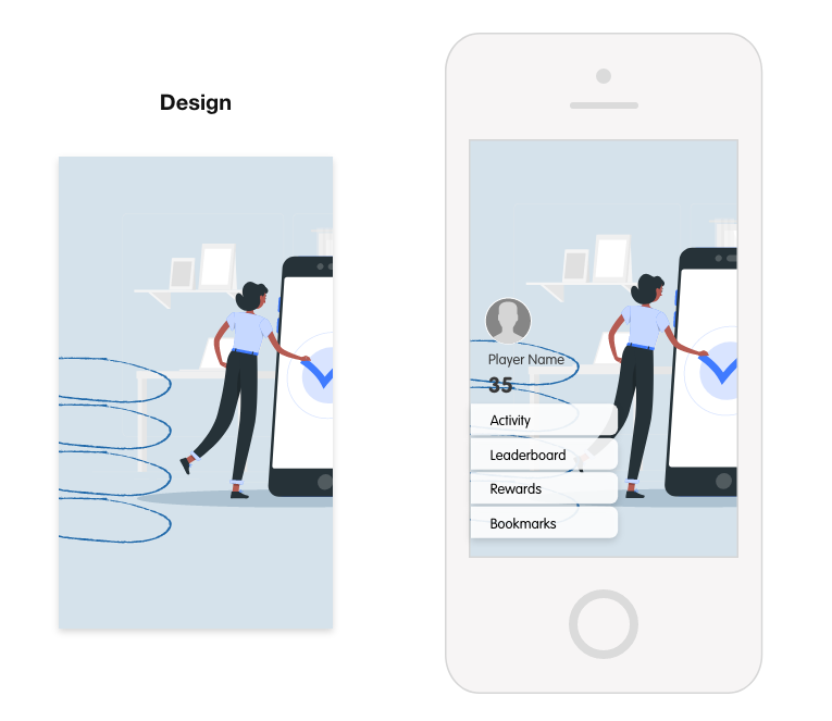
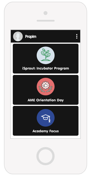
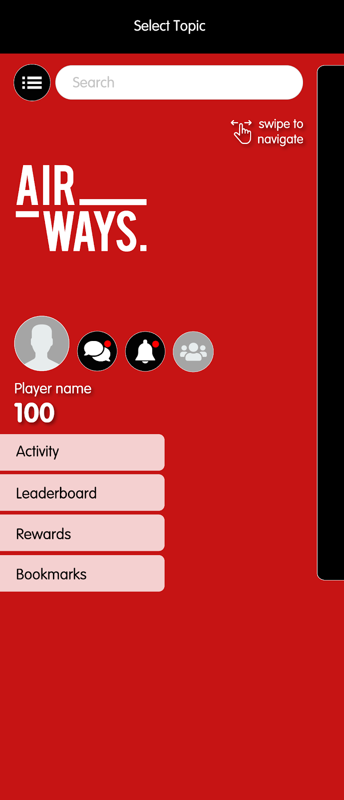
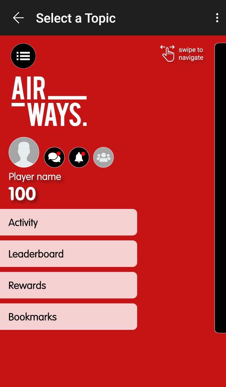
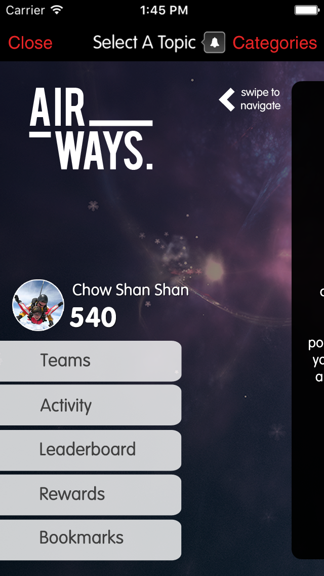
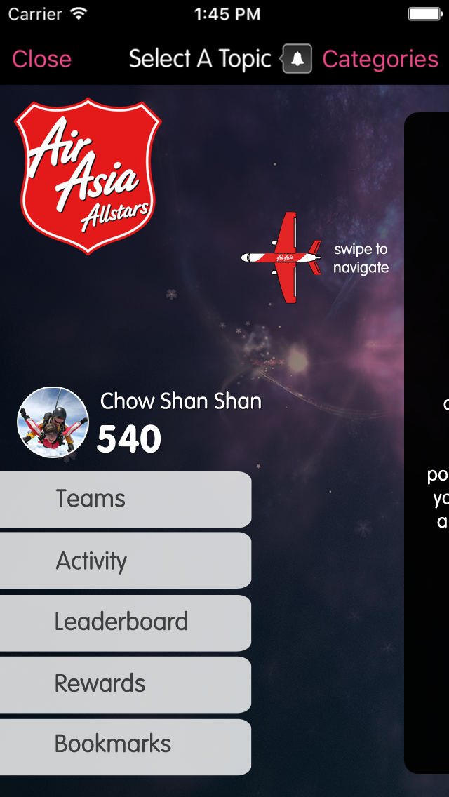
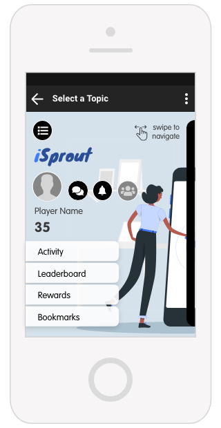
Home Screen
The Home screen is where Players can navigate to different parts of the game, such as the different Topics, Challenges, Flashcards, Achievements, and Rewards.
You design should leave some “safe space” for the buttons and other elements.
Home screen on iOS (left) and Android (right). These designs are flexible enough to fit on different screen sizes and leaves some “safe space” for the profile area.
App Customization and Image Dimensions
Home Screen
The Home screen contains:
Topic List view button (on iOS only; optional) Search bar On Android, this search bar is accessible under the topbar menu. | |
Swipe to navigate button Design can be customized, such as the examples below. | |
Player profile
| |
Default buttons
|
App Customization and Image Dimensions
Home Screen
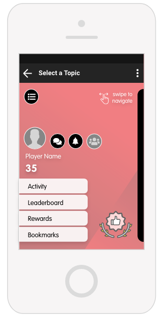
The design of your Home screen background will not scroll when you swipe to view Topic cards, so your Home screen design should be versatile.
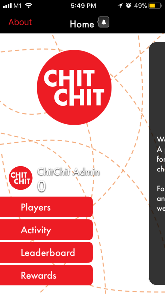
This is the flow for the Home screen for ChitChit.
You can see that when you swipe to view different topic cards and challenges, the background remains fixed.
App Customization and Image Dimensions
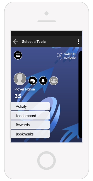
Home Screen (customizable)
We also have a feature accessible via our Admin Dashboard where you can customize the home screen background per Project whenever you like.
This is best used for:
Read our article to learn more about the custom home screen background feature: | |

App Customization and Image Dimensions
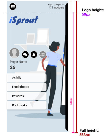
Home Screen (iOS)
iOS Home Screen Background | |||
Image is aligned to top when cropped to different phone sizes, so give space allowance on left, right and bottom padding when creating the iOS Login Screen images. | |||
Description | File Name | Dimension WxH (px) | Navbar H (px) |
Home screen @ 1x | home_bg.png | 320x568* | 44px |
Home screen @ 2x | home_bg@2x.png | 640x1386** | 88px |
Home screen @ 3x | home_bg@3x.png | 1125x2436*** | 176px |
iOS Home Screen Swipe to Navigate buttons (Optional) | |||
Description | File Name | Dimension WxH (px) | |
iPhone retina (swipe to navigate button) | home_btn_play@3x.png | Minimum of 176x176* | |
iPhone retina (swipe to navigate button) | home_btn_play@2x.png | Minimum of 88x88* | |
iPhone non-retina (swipe to navigate button) | home_btn_play.png | Minimum of 44x44* | |
[appname]\iOS\homeview |
App Customization and Image Dimensions
Home Screen (iOS)
iOS Home Screen Background | |||
Description | File Name | Dimension WxH (px) | Navbar H (px) |
Home screen | home_bg.png | 320x568* | 44px |
*Take care to adhere to the following guidelines, as this asset has a generous crop on some devices.
The dashed line indicates the safe area for the design. Place all important elements below the Logo height –
|
App Customization and Image Dimensions
Home Screen (iOS)
iOS Home Screen Background | |||
Description | File Name | Dimension WxH (px) | Navbar H (px) |
Home screen @ 2x | home_bg@2x.png | 640x1386** | 88px |
**Take care to adhere to the following guidelines, as this asset has a generous crop on some devices.
The dashed line indicates the safe area for the design. Place all important elements below the Logo height and above the Safe height –
|
App Customization and Image Dimensions
Home Screen (iOS)
iOS Home Screen Background | |||
Description | File Name | Dimension WxH (px) | Navbar W (px) |
Home screen @ 3x | home_bg@3x.png | 1125x2436*** | 176px |
**Take care to adhere to the following guidelines, as this asset has a generous crop on some devices.
The dashed line indicates the safe area for the design. Place all important elements below the Logo height and above the Safe height –
|

App Customization and Image Dimensions
Home Screen (Android)
Android Home Screen Background | ||
Description | File Name | Dimension WxH (px) |
XXXHDPI | home_bg.png | 1280x1920a |
XXHDPI | home_bg.png | 960x1600b |
XHDPI | home_bg.png | 720x1230c |
HDPI | home_bg.png | 540x923d |
MDPI | home_bg.png | 360x615e |
Android Home Screen Swipe to Navigate buttons (optional) | ||
Description | File Name | Dimension WxH (px)* |
XXXDPI (swipe to navigate button) | home_swipe.png | Minimum of 110x110 |
XXHDPI (swipe to navigate button) | home_swipe.png | Minimum of 88x88 |
XHDPI (swipe to navigate button) | home_swipe.png | Minimum of 55x55 |
HDPI (swipe to navigate button) | home_swipe.png | Minimum of 44x44 |
MDPI (swipe to navigate button) | home_swipe.png | Minimum of 33x33 |
For XXXHDPI: [appname]\android\drawable-xxxhdpi For XXHDPI: [appname]\android\drawable-xxhdpi For XHDPI: [appname]\android\drawable-xhdpi For HDPI: [appname]\android\drawable-hdpi For MDPI: [appname]\android\drawable-mdpi |
*For the “Swipe to navigate” button, you are free to come up with your own size and design as long as it meets the minimum size dimensions.
App Customization and Image Dimensions
Home Screen (Android)
Android Home Screen Background | ||
Description | File Name | Dimension WxH (px) |
XXXHDPI | home_bg.png | 1280x1920a |
aTake care to adhere to the following guidelines, as this asset has a generous crop on some devices.
The dashed line indicates the safe area for the design. Place all important elements to the right of the Logo width and above the Safe height –
|
App Customization and Image Dimensions
Home Screen (Android)
Android Home Screen Background | ||
Description | File Name | Dimension WxH (px) |
XXHDPI | home_bg.png | 960x1600b |
bTake care to adhere to the following guidelines, as this asset has a generous crop on some devices.
The dashed line indicates the safe area for the design. Place all important elements to the right of the Logo width and above the Safe height –
|

App Customization and Image Dimensions
Home Screen (Android)
Android Home Screen Background | ||
Description | File Name | Dimension WxH (px) |
XHDPI | home_bg.png | 720x1230c |
cTake care to adhere to the following guidelines, as this asset has a generous crop on some devices.
The dashed line indicates the safe area for the design. Place all important elements to the right of the Logo width and above the Safe height –
|

App Customization and Image Dimensions
Home Screen (Android)
Android Home Screen Background | ||
Description | File Name | Dimension WxH (px) |
HDPI | home_bg.png | 540x923d |
dTake care to adhere to the following guidelines, as this asset has a generous crop on some devices.
The dashed line indicates the safe area for the design. Place all important elements to the right of the Logo width and above the Safe height –
|

App Customization and Image Dimensions
Home Screen (Android)
Android Home Screen Background | ||
Description | File Name | Dimension WxH (px) |
MDPI | home_bg.png | 360x615e |
eTake care to adhere to the following guidelines, as this asset has a generous crop on some devices.
The dashed line indicates the safe area for the design. Place all important elements to the right of the Logo width and above the Safe height –
|

App Customization and Image Dimensions
Android-specific images
Download Icon (optional)
The download icon is what is shown in the status bar when the app is processing a submitted answer when doing a challenge. Usually, you can use the App Icon as the Download Icon.
*If no download icon is provided, the icon will be shown instead as a blank square.
Android Download icon | ||
Description | File Name | Dimension WxH (px) |
XXXHDPI | icon_status_download.png | 96x96 |
XXHDPI | icon_status_download.png | 72x72 |
XHDPI | icon_status_download.png | 48x48 |
HDPI | icon_status_download.png | 36x36 |
MDPI | icon_status_download.png | 24x24 |
For XXXHDPI: [appname]\android\drawable-xxxhdpi For XXHDPI: [appname]\android\drawable-xxhdpi For XHDPI: [appname]\android\drawable-hdpi For HDPI: [appname]\android\drawable-hdpi For MDPI: [appname]\android\drawable-mdpi |
App Customization and Image Dimensions
Android-specific images
Android Feature Graphic
This is the banner in the Android store.
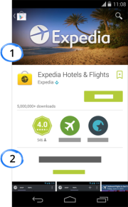
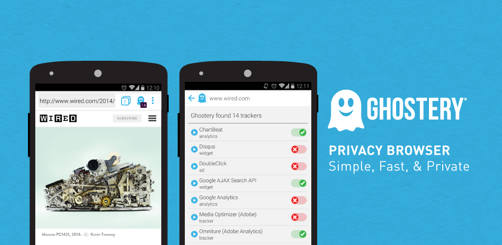
(Left) #1 shows where the feature graphic will appear, using Expedia as an example
(Right) Example of a Feature Graphic from the Ghostery app.
This is the image the user will see when they view the app page in the Google Play store. At a glance, the Feature Graphic should give the impression of the app you wish to convey to potential users.
Do NOT TinyPNG this feature graphic.
Here are some examples of Android feature graphics:
https://incipia.co/post/app-marketing/google-play-feature-graphic-ideas/
Android Feature Graphic | ||
Description | File Name | Dimension WxH (px) |
Feature Graphic | [app_name]_featuregraphic.png | 1024x500 |
[appname]\android |
Appendix
- FAQs
- Folder Organization Chart
- Resources
FAQs
Are fonts customizable?
You are able to change the font of the app. However, please be aware that we have designed the specifications of our app to suit our default font (VAG Rounded) and changing the font may cause some alignment issues.
Unfortunately, we will not be able to customize alignment if you use a different font than VAG Rounded.
Is the bar on top of the app customizable?
No – this will remain as it is.
How customizable is the white-label app? (e.g. the buttons, layout etc.)
Please consult your Gametize representative to learn more about what customizations will work for your project. Do keep in mind that certain customizations may affect the scalability and stability of the app, and your Gametize representative will inform you accordingly.
What other documents should I consult/use?
We have several documents you should consult in addition to this design guide:
- .PSD & .AI Templates: We have some Photoshop and Illustrator files for you to create your mockups with. You can find these templates on https://corp.gametize.com/white-label.
- White-label App Submission Guide: This will give you a good idea of the process we go through when submitting apps to the App Store and Play Store.
- White-label App Details Form: Use this form when filling out your app name, app description, app category, and other essential details.
(If we have not provided you these documents, let your Gametize representative know!)
Folder Organization Chart
iOS | ||
[appname]\iOS | ||
↳ [appname]\iOS\misc | icon_1024.png | 1024Wx1024H |
icon_180.png | 180Wx180H | |
icon_120_1.png | 120Wx120H | |
icon_120_2.png | 120Wx120H | |
icon_87.png | 87Wx87H | |
icon_80.png | 80Wx80H | |
icon_60.png | 60Wx60H | |
icon_58.png | 58Wx58H | |
icon_40.png | 40Wx40H | |
1x.png | 320Wx480H | |
2x_1.png | 640Wx960H | |
2x_2.png | 640Wx960H | |
retina4_1.png | 640Wx1136H | |
retina4_2.png | 640Wx1136H | |
4_7inch.png | 750Wx1334H | |
x.png | 1125Wx2436H | |
5_5inch.png | 1242Wx2208H | |
↳ [appname]\iOS\loginview | signin_bg.png | 320Wx568H |
signin_bg@2x.png | 640Wx1386H | |
signin_bg@3x.png | 1125Wx2436H | |
coachmark1.png coachmark2.png coachmark3.png coachmark4.png coachmark5.png | 320Wx568H | |
coachmark1@2x.png coachmark2@2x.png coachmark3@2x.png coachmark4@2x.png coachmark5@2x.png | 640Wx1386H | |
coachmark1@3x.png coachmark2@3x.png coachmark3@3x.png coachmark4@3x.png coachmark5@3x.png | 1125Wx2436H | |
↳ [appname]\iOS\homeview | home_bg.png | 320Wx568H |
home_bg@2x.png | 640Wx1386H | |
home_bg@3x.png | 1125Wx2436H | |
Android | ||
[appname]\android | launcher.png | 512xWx512H |
[appname]_featuregraphic.png | 1024Wx500H | |
↳ [appname]\android\drawable-xxxhdpi | launcher.png | 192Wx192H |
launch.png | 1280Wx1920H | |
login_bg.png | 1280Wx1920H | |
tour1.png tour2.png tour3.png tour4.png | 1280Wx1920H | |
home_bg.png | 1280Wx1920H | |
icon_status_download.png | 96Wx96H | |
↳ [appname]\android\drawable-xxhdpi | launcher.png | 144Wx144H |
launch.png | 960Wx1600H | |
login_bg.png | 960Wx1600H | |
tour1.png tour2.png tour3.png tour4.png tour5.png | 960Wx1600H | |
home_bg.png | 960Wx1600H | |
icon_status_download.png | 72Wx72H | |
↳ [appname]\android\drawable-xhdpi | launcher.png | 96Wx96H |
launch.png | 720Wx1230H | |
login_bg.png | 720Wx1230H | |
tour1.png tour2.png tour3.png tour4.png | 720Wx1230H | |
home_bg.png | 720Wx1230H | |
icon_status_download.png | 48Wx48H | |
↳ [appname]\android\drawable-hdpi | launcher.png | 72Wx72H |
launch.png | 540Wx923H | |
login_bg.png | 540Wx923H | |
tour1.png tour2.png tour3.png tour4.png tour5.png | 540Wx923H | |
home_bg.png | 540Wx923H | |
icon_status_download.png | 36Wx36H | |
↳ [appname]\android\drawable-mdpi | launcher.png | 48Wx48H |
launch.png | 360Wx615H | |
login_bg.png | 360Wx615H | |
tour1.png tour2.png tour3.png tour4.png | 360Wx615H | |
home_bg.png | 360Wx615H | |
icon_status_download.png | 24Wx24H | |
Resources
General
- Compressing .png files: http://tinypng.org
- VAG Rounded font download: https://www.wfonts.com/font/vagrounded
- Filename extension conventions: https://en.wikipedia.org/wiki/Filename#Filename_extensions
- Guide to common device resolutions: https://material.io/resources/devices/
- Launch screen examples: http://appdevelopment.daffodilsw.com/blog/25-best-splash-screen-examples-for-mobile-apps
- White-label templates: https://corp.gametize.com/white-label
- App icon examples: http://iosicongallery.com
iOS
- Guide to iPhone resolutions: https://www.paintcodeapp.com/news/ultimate-guide-to-iphone-resolutions
- Guide to iOS app icons: https://developer.apple.com/library/ios/qa/qa1686/_index.html
Android
- Guide to common Android resolutions: https://material.io/resources/devices/
- Creating Android icons: https://iconhandbook.co.uk/reference/chart/android/
- Guide to Android app icons: https://developer.android.com/google-play/resources/icon-design-specifications
- Examples of Android feature graphic: https://incipia.co/post/app-marketing/google-play-feature-graphic-ideas/